Showing posts with label Christmas. Show all posts

Monday, December 21, 2015

04 Cool Poster Design from Sofia Coppola Films

Sofia Coppola is one of the most established female film directors of present time. She won Academy Awards for Best Original Screenplay for the critically acclaimed film Lost in Translation in 2013. She is daughter of master director Francis Ford Coppola. Tough she started her career as an actress but ended up as a stylist and creative film director. On 4th December, she released her latest film named on great Bill Murray, A Very Murray Christmas, exclusively on Netflix. On this occasion The Poster World brings to you 04 of the best posters from Sofia Coppola's filmography.

1. The Virgin Suicides (1999)
[Copyright- American Zoetrope, Muse Productions, Eternity Pictures]

Cover of the first film by Coppola is as stylistic as her film. Frames of different width and distance we see on the middle of the cover are actually the way Coppola visualizes films. Fonts and background colors are very well matched. Subtle and beautiful!

TPW Rating- 4/5

2. Lost in Translation (2003)
[Copyright- American Zoetrope, Tohokushinsha Films]
Our favorite Bill Murray on the poster! You can not deny the presence of Bill Murray itself a huge plus point for the design. Look at the Tokyo city behind him, look at the texture of the hotel room. A very good composition as a whole and look Murray is gazing straight to camera. Simplistic and joyful!

TPW Rating- 5/5

3. Somewhere (2010)

[Copyright- Pathe, Medusa Film, Tohokushinsha Films, American Zoetrope]
A father-daughter story told by this single poster quite easily. If you've got the synopsis of the movie you would easily communicate with it. A posh hotel along with a beautiful green garden is present on the poster. Look at the contrast of font colors with the green. Cool and calm design!

TPW Rating- 3.5/5
 
4. The Bling Ring (2013)
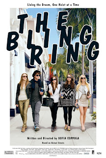
[Copyright- American Zoetrope, NALA Films]
Poster of this film is very teen-like, as it actually depicts the storyline of the film. Look at the dress up, the cheesy fonts and urban scenery behind. These are actually carrying the idea of a teen based movie for all. Again a stylish poster by Coppola!

TPW Rating- 3.5/5 

Friday, August 21, 2015

Poster Review - The Hateful Eight

Quentin Tarantino's 8th film is variedly named as The Hateful Eight/The H8ful Eight/The Hateful 8. It is a dream project by Tarantino, but that dream turned into a nightmare when the film's script leaked and became public. Tarantino immediately decided not to make this a movie, rather change the script to a novel. But after a public reading arrangement of the leaked script this visionary director decided to make feature film again. The film would be ready for a release on the Christmas Day, 2015.

So, how are the posters of one of the most awaited movies of this year have been? Different types of posters are used on different time and occasion for The Hateful Eight. Tarantino released two teaser poster long ago with some gory atmosphere all around. Here are those two posters.

#01
'Obviously bloody'
This first teaser poster is quite simple, as only fonts are speaking and speaking a lot. Look at the 8 of the 'h8ful'. No poster of Tarantino is actually complete without blood. Come on!

#02
'Yes, it's God damn Western!'
Second one is about a revolver or a boot, but both of which actually would explain it as an Western film, obviously with a blood red background. Great one as a teaser poster. 

After these 'above reviewed' posters the production began and Tarantino took some time to release two more posters dedicated to give hints of the storyline and also to show the gory affection of himself.

#03
'Red and white contrast'
Here the first poster is showing a stagecoach running through icy trail and leaving blood behind. White background is actually depicting ice and for that redness of the blood is getting more prominent. Idea is obviously Tarantino styled and it is definitely lovable.

#04
'Storyteller'

This second one is actually telling more than any previous ones. We can see a hilly road, where the blood is abruptly shattered here and there. There is a hut up on the hill and two characters are heading towards the top as some are waiting. This one is really more descriptive and thoughtful.

Two recent posters were also released days ago. So how these posters have been. Let's check.

#05
'Mexican it is'
Here on this package of posters we would meet new characters of the film. This one here is - The Mexican. One by one we would know all the characters as we see eight marks on the background. One Grey one (out of other seven red) actually suggesting that 'look this is the one we are mentioning'. The posters seems bit average to me.    
                
#06
'Promising but...'
Similar to the previous one but it actually looks better. The same formula as here as two of the marks are Grey out of eight. So we are talking about two characters here. One is 'The Hangman' and the other is 'The Prisoner'. With the background of hillside the poster looks promising but bit stereotypical same as one we mentioned earlier.   

(Last update is that there are more posters on the web on the serialization of last two posters)