Showing posts with label film. Show all posts

Tuesday, February 2, 2016

10 Witty Deadpool Posters

Deadpool, one of the most awaited film of the year, is creating a lot of buzz throughout the universe and it has release date just two days before the Valentine's Day 2016. The marketing for this Marvel production has been phenomenal. Some really witty and funny posters along with trailers were released in last six months. All of this hit the right bottom of the audience. So mouth of word for this film is already very impressive. The Poster World brings to you 10 witty Deadpool posters, that attracted the fan base for this new Marvel franchise. All the posters are described by the characteristics of the poster.

1. Raw, Foul Mouthed and Aggressive

'Real Deadpool'


'The poster text is about getting a load of our anti-hero and the look is really gross and totally Deadpool in style'

TPW Rating- 4/5      


2. Mocking Other Superpowers (Part 1)

'Mocker Deadpool'


'Its really funny that Marvel comes up with the idea of mocking their heavyweight DC Comics opponents. Fine thing is they do it with style and courage.'

TPW Rating- 3.5/5      


3. Mocking Other Superpowers (Part 2)

'Mocker Deadpool of Gotham'


'Why not Batman too? Deadpool made a semi-pro batman logo look like a classy one. Half dark half light look of the bad mouth guy is super funny.'

TPW Rating- 4/5      


4. Even Mocking Mocking Jay!

'Mr. J Law Deadpool'


'This one is funniest of all. Even Jennifer Lawrence would have been really proud of that chest! It gives a hint how cheesy and pervert Deadpool can be' 

TPW Rating- 4/5


5. Human side of a Super Hero 


'Deadpool on a High Neck Sweater'


'No super hero fan on their wildest imagination can think of favorite hero on a high neck sweater. But Deadpool is a new class of super hero brother. What can you say?'

TPW Rating- 5/5      


6. Cuddling side of a Super Hero (Part 1)

'Deadpool for Kids'


'Deadpool perfectly hits on the basic question of responsibility. Why a super hero has to be responsible? Because our studios said so? We, audience also have a question to Deadpool. Can he break this rule? Let's see'

TPW Rating- 3.5/5      


7. Cuddling side of a Super Hero (Part 2)

'New Face of Justice- Deadpool'


'Another unrealistic super hero look by Deadpool. So it gives us an impression of Deadpool's thoughts about the justice system.'

TPW Rating- 4/5      


8.Using Bodyparts
'Deadpool Has Great Ass'


'Hardly a super hero's ass became useful on last hundred years film industry. Deadpool broke the norm and we would say why not?'

TPW Rating- 4.5/5      


9. Loving, Caring and Affectionate (Part 1)

'Lover Deadpool'


'The idea of Valentine's Day perfectly blends with Deadpool's vision and philosophy! Yes, it was a very bad joke. But please believe producers of the film didn't think differently'

TPW Rating- 4/5      


10. Loving, Caring and Affectionate (Part 2) 

'Deadpool Has Nothing But Love'


'Last but not least this poster actually shocked a hell out of everybody. So, Deadpool is going to be Ryan Reynolds romancing movie? Be sure, it isn't going to be like that.'

TPW Rating- 4.5/5      

Tuesday, January 5, 2016

Most Striking Film Posters of January 2016

Only three posters made the mark for The Poster World's January choice list. We had big releases (including biggies like Star Wars: The Force Awakens, Joy, The Hateful Eight, Point Break and many more) on December 2015 and January also wasn't quite remarkable like past years. There were many releases but the posters from those were not quite mentionable. Let's get into business and get to know about the list of posters that made the mark.

1. Band of Robbers (2016)
Copyright- Gravitas Ventures
This comedy thriller doesn't even have Wikipedia page, but still managed to make our top list. From January releases, we chose this bright red backgrounded poster. This poster's placing of characters is really cool. But there are uncertainties about the fonts. Title name looks average but the tag line's font looks really poor.

TPW Rating- 3.5/5

2. Aferim! (2016)
Copyright- Parada Film, Micro Film
Aferim! is a Romanian film releasing mid-January on USA. With the dusky look of the poster we can guess that there could be some Western element on the film. The simplicity of the poster is really striking and fonts are also blending with the poster design work. Cool and innovative thinking! Suggestion also exists to understand the storyline.

TPW Rating- 4/5
  
3. Jane Got A Gun (2016)
Copyright- The Weinstein Company

Another Western on our list! This Natalie Portman starrer film poster is really a very good composition of ideas. Gaze of the character, cloudy background behind, her holding of the gun, 19th Century dress-up and amazing use of fat fonts really mingle with each other and gives us a fascinating yet not spectacular poster. Grey and gloomy at it's best!

TPW Rating- 4.5/5

Monday, December 21, 2015

04 Cool Poster Design from Sofia Coppola Films

Sofia Coppola is one of the most established female film directors of present time. She won Academy Awards for Best Original Screenplay for the critically acclaimed film Lost in Translation in 2013. She is daughter of master director Francis Ford Coppola. Tough she started her career as an actress but ended up as a stylist and creative film director. On 4th December, she released her latest film named on great Bill Murray, A Very Murray Christmas, exclusively on Netflix. On this occasion The Poster World brings to you 04 of the best posters from Sofia Coppola's filmography.

1. The Virgin Suicides (1999)
[Copyright- American Zoetrope, Muse Productions, Eternity Pictures]

Cover of the first film by Coppola is as stylistic as her film. Frames of different width and distance we see on the middle of the cover are actually the way Coppola visualizes films. Fonts and background colors are very well matched. Subtle and beautiful!

TPW Rating- 4/5

2. Lost in Translation (2003)
[Copyright- American Zoetrope, Tohokushinsha Films]
Our favorite Bill Murray on the poster! You can not deny the presence of Bill Murray itself a huge plus point for the design. Look at the Tokyo city behind him, look at the texture of the hotel room. A very good composition as a whole and look Murray is gazing straight to camera. Simplistic and joyful!

TPW Rating- 5/5

3. Somewhere (2010)

[Copyright- Pathe, Medusa Film, Tohokushinsha Films, American Zoetrope]
A father-daughter story told by this single poster quite easily. If you've got the synopsis of the movie you would easily communicate with it. A posh hotel along with a beautiful green garden is present on the poster. Look at the contrast of font colors with the green. Cool and calm design!

TPW Rating- 3.5/5
 
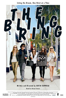
4. The Bling Ring (2013)
[Copyright- American Zoetrope, NALA Films]
Poster of this film is very teen-like, as it actually depicts the storyline of the film. Look at the dress up, the cheesy fonts and urban scenery behind. These are actually carrying the idea of a teen based movie for all. Again a stylish poster by Coppola!

TPW Rating- 3.5/5 

Tuesday, December 8, 2015

04 Great Posters from Quentin Tarantino Films

Quentin Tarantino has been one of the greatest film directors of all time. He is a master maker and an inspirational figure to this generation. He reached the peak of cinematic excellence from being a video store clerk with crazy knowledge about the history of cinema. His films like Reservoir Dogs, Pulp Fiction and two volumes of Kill Bill instantly influenced the pop culture of our times. Posters of Tarantino films been a big part of that influence. Tarantino is releasing his eighth film 'The Hateful Eight' on this Christmas, which also had some very good posters. 

On the occasion of Tarantino's new release The Poster World brings to you four of the best posters from Quentin Tarantino films.

1. Pulp Fiction (1994)
Copyright- Miramax
Pulp Fiction created a cultural phenomena at the time of it's release and still regarded as one of the pop culture icon of our times. Poster of this film been highly discussed for a last two decades. Many interpretations and explanations given. But in truth this poster is a sheer classic. It can not get better than this. This is highly inspired by Film Noir as Uma Thurman is lying in low light with a seductive femme-fatale style, her hand is on a cigarette and a gun is in front of her. Look at the poster paper, it looks damaged; fonts are pulpy and everything about the background color is bit cheap. A stylistic masterwork!

TPW Rating- 5/5

2. Kill Bill: Volume 1 (2003)
Copyright- Miramax
This is a simple cover compared to Pulp Fiction. Background covered by deep yellow, obviously similar to the costume Thurman is wearing. A samurai sword covering almost half of the poster and it tells where this all is going. Fonts of the poster are also cool.

TPW Rating- 4.5/5
  
3. Death Proof (2007)
Copyright- Dimension Films
Through his filmography Tarantino has always given some kind of homage to particular film or film genres. Death Proof was a homage to the 70s' films on car chasing and exploitation. It released with another film, directed by Robert Rodriguez, named Planet Terror. But this poster came out solo. Poster's color has a 60s' or 70s' look. Fonts and figures also have same characteristics.Classic example of a classic film poster!

TPW Rating- 5/5 
  
4. Inglorious Basterds (2009)
Copyright- The Weinstein Company and Universal Picture
Nazi killing basterds are back! First of all this is not the main poster of the film. This poster only depict Brad Pitt standing on the dead bodies of multiple Nazi soldiers. The idea seems brutal but this is what Tarantino is all about. He is the guy who can make violence aesthetically awesome. Fonts are also quite cool.

TPW Rating- 4.5/5

Monday, November 23, 2015

Top 04 Posters from Tom Hooper Films

Academy award winner director Tom Hooper is coming with his new film The Danish Girl (2015) this coming Friday, 27th November 2015. At the age of 12, Hooper decided to become a film director after he got in touch with a book on film and television. After two years Hooper made a film named Bomber Jacket, which got Runner-up on BBC Younger Filmmakers' Competition. Since that time Hooper never had to look back at his career. He made several Television productions and five feature length films.

From the illustrious career of Tom Hooper, The Poster World brings to you four of the best theatrical posters. There are some definite big names among those and let's see how can we rate those films' posters.

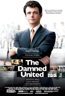
1. The Damned United (2009)
Copyright- BBC Films, Left Bank Pictures, Screen Yorkshire

This film is about the great English football manager Brian Clough, who had a glorious career with average football teams. This 2009 sports drama Michael Sheen on the lead and he himself was on the cover, posing like a true manager. Cover looks stylish and meaningful. There are straight lines through the mid-area of the poster emblemed with different stills from the movie. Typical English poster!

TPW Rating- 4/5

2. The King's Speech (2010)
Copyright- UK Film Council, See-Saw Films, Bedlam Productions
The King's Speech is the pathway film for Tom Hooper. This David Seidler written 2010 drama won Hooper Best Director Award at Academy Awards. Film won four of them in total at Oscar. This critically and commercially successful film had some great covers. Among those the presented one at the site is the bench marker. It kind of gives an impression about the story. Deep yellow background and red font colors has mixed quite well and audience start to guess immediately that the film may be a jolly minded one or a comedy maybe. Which is somewhat true you would know when you see the film.

TPW Rating- 4.5/5  
   
3. Les Miserables (2012)
Copyright- Relativity Media, Studio Canal, Working Title Films, Cameron Mackintosh Ltd. 
With a sensational ensemble cast, this epic drama proved to be a successful film by Hooper. Based on 1862 novel by Victor Hugo, Les Miserables proved to be a great film at Academy Awards, as it received eight nominations and won three of them. There were individual posters for individual characters. But an ensemble poster was chosen for rating. It's typical poster and looks like a studio based film with big stars dazzling.

TPW Rating- 3/5

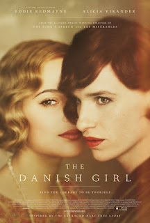
4. The Danish Girl (2015)
Copyright- Working Title, Pretty Pictures, Revision Pictures, Senator Global Productions
Film is based on real life events of Lili Elbe, first recipient of sex reassignment surgery. As Hooper is a specialist on Autobiographical films, it's sure that the film would come out really good. Eddie Redmayne returns to this film after his Academy Award winning film Theory of Everything and is co-joined by Swedish actress Alicia Vakander. Poster released months ago and looks classy and colorful! It gives a nostalgic impression of bygone era. Redmayne looks perfect for his role.

TPW Rating- 4/5 

Tuesday, October 13, 2015

04 Best Posters from Danny Boyle Filmography

Danny Boyle is one of the most prominent British film directors of recent times. Popular films like Trainspotting (1996), The Beach (2000), Slumdog Millionaire (2008), 127 Hours (2010), and very recent Steve Jobs (2015), all are directed by this great maker. Though Boyle was meant to become a priest on his childhood, he ended up becoming a successful film maker.

Posters used on Danny Boyle films are always subjective and meaningful. The Poster World chose 04 most amazing posters from Danny Boyle's illustrious filmography.

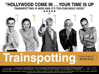
1. Trainspotting (1996)

This Ewan McGregor starred cult hit was a trend setter of a film for last two decades. The poster design for this film was really catchy and modern. Look at the characters, look at that yellow background behind the film title. It gives us an introduction towards the film already.

TPW Rating: 3.5/5
 

2. 28 Days Later (2002)
On 2002, this film reassured all Hollywood studios that if the storytelling is correct then even a zombie horror can look good. Yes, this film has changed the mood of seriousness about zombies. The poster background is deep red, obviously same as the color of blood. In front of that bold white fonts are really creating a frightening experience.

TPW Rating: 4/5


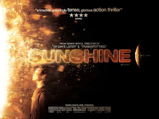
3. Sunshine (2007)
First of a kind science fiction by Danny Boyle was commercially a failure but was critically praised by many critics. This psychological thriller's poster is showing that someone is very close to the sun and is on the verge of getting burnt. Poster is meaningful and depicting the nearness of a character to the sun. Fonts and background are above average.

TPW Rating: 3.5/5


4. 127 Hours (2010)
This film was one of the most anticipated films of last decade and as a poster the best from Danny Boyle. It's about a person who lose his hand during tracking. Look at the poster! It's an unbelievable thing. It gives us an overall idea on the film. That's why it's an intelligent poster with great use of colors and fonts.

TPW Rating: 5/5 

Thursday, October 1, 2015

Darren Aronofsky Filmography on 06 Marvelous Posters

Darren Aronofsky is one the most prominent American film directors alive. Along with direction he also does his duty of being a screenwriter and film producer. Aronofsky's films are disturbing and surreal in some sense, but visually they are very striking. After successful first film Pi (1998), Requiem for A Dream (2000) and films like The Wrestler (2008) and Black Swan (2010) have been really out of formula and depicted a new kind of story telling. For his works Aronofsky achieved many recolonizations such as a nomination for Best Director on Academy Awards.

The posters of Aronofsky films are weired and minimalist. On his posters he focuses on certain things like use of one single eye or a single face, which is very risky if the commercial angle is thought thoroughly. Let's see how Aronofsky executed his posters for the 06 films he directed.

1. Pi (1998)
The first film by Darren Aronofsky got Best Direction award on Sundance Film Festival, which is really very appreciable achievement. As the film title refers to the math symbol of pi, Aronofsky wanted to show that symbol on the poster. On another poster one facial expression was given as background with the symbol in front. With a petty budget of $68,000, this film gained more than it expected. Poster of the film is showing the symbol of pi with a back light projection. Cool and composite!   

TPW Rating: 3/5

2. Requiem for A Dream (2000)
The film is all about drugs. Drugs have different dimensions and we all are deeply affected by them- that's the basic theme of the film. So when it came to the point to design the poster for the film, first thing should have appeared on the mind of Aronofsky is how easily the eyes change. On the film the change of eyes were shown on different scenes while taking drugs. The poster is on average OK, but with that single eye this poster becomes something more than alright.

TPW Rating: 4/5   

3. The Fountain (2006)

The Fountain was a dream project by Darren Aronofsky, but for the budget reason the film was on the risk of getting the light. After cutting the budget to half he got the nod to do the film. Film looks great though it was poorly received on box office. Poster of the film gives us a science based impression but it is hard to understand it properly if you haven't watch the movie first. There are two characters and a strange tree. But they don't actually mean anything or tell us to watch the film.

TPW Rating: 2/5 


4. The Wrestler (2008)
Micky Rourke gave an extraordinary performance on this film and blew everyone's mind apart. Again a minimalist film poster, not showing Rourke's character's face properly to general people. But what the poster surely deliver is it introduce us to someone who is standing tired in front of darkened arena of Wrestling. It gives us an idea of the story intelligently.

TPW Rating: 4/5

5. Black Swan (2010)
This critically and commercially successful psychological thriller is one of the best films by Aronofosky. The film told the story of a ballet dancer, who faces extreme pressure on taking the role of a protagonist on the ballet Swan Lake. The poster definitely depicts the idea of the film story with the face of the character of Natalie Portman. No it doesn't quite explains the tension and psychological tide of the character but it gives an uncanny feeling, gives an impression that something is not right with that expression. Bold and otherworldly! 

TPW Rating: 5/5      

6. Noah (2014)
The biggest budget for a film Aronofsky ever got and for that studio had a lot of influence on the film. But Aronofsky dreamed of this project from his childhood, so this thing had to be true. Poster of the film is not like Aronofsky's previous ones, but the poster had to deal with a bigger scenario as it had to depict that the World is near to the end. Again we don't see the face of Russel Crowe as Noah himself. It has an ancient as well as larger than life feel to it.

TPW Rating: 3.5/5    

Tuesday, September 15, 2015

05 Best Posters from Wes Anderson Films

It is now universally recognized that Wes Anderson is a living genius of a film maker. He has a very unique, weired type of parallel universe where characters are built upon the way Anderson wants. He has a tendency of working with same artists time and time, actually to frame his fictional world with his close and known friends and mates. Among those Bill Murray, Owen Wilson, Jason Schwartzman have featured regularly on his films. His choice of stories is also exemplary, as he chose exactly those movies where he actually can create a world of his own.

TPW (The Poster World) brings to you 05 of the best posters from Wes Anderson films, as like his films his posters are also very stylish and have incomparable qualities. The posters are very lively and gives a breath of freshness to your eyes. Let's have a trip to the wonderful world of Mr. Anderson.

1. The Royal Tenenbaums-
The film was one of the biggest ensemble cast ever. Can you believe a cast of Gene Hackman, Angelica Huston, Bill Murray, Gwyneth Paltrow, Ben Stiller, Luke Wilson, Owen Wilson, Danny Glover? The film was nominated for Best Original Screenplay too. Poster idea of this film was mainly to portrait every single character of the movie. Because they are attached to each other in strange relations and obviously it tells us a tale bout the Tenenbaums. A good decorative poster!  

TPW Rating: 03 out of 05.

2. The Life Aquatic with Steve Zissou-
Another ensemble cast by Wes Anderson, as he uses great actors like Bill Murray, Cate Blanchett, William Dafoe, Michael Gambon, Owen Wilson etc. Based on the real life of famous French diver Jacques-Ives Cousteau. This time the poster goes under water. We see a research vessel named Belafonte and all the important casts inside it. Colorful and intelligently done poster!   

TPW Rating: 04 out of 05.

3. The Darjeeling Limited-
The film is not like other Wes Anderson films with an all-out ensemble cast. This film was a homage to the great Bengali filmmaker Satyajit Ray. Basic theme of the film was taken from the way Satyajit portrayed his stories and characters on his great films. The poster is really good and it also gives us some kind of impression on the characters. Look at the background! If you are well aware of the World then you may understand the film backdrop is also India. Brilliant!     

TPW Rating: 04 out of 05.

4. Moonrise Kingdom-
Moonrise Kingdom by Wes Anderson is a fascinating movie about two kids away from home. This film also have an ensemble cast of Bruce Willis, Edward Norton, Bill Murray, Tilda Swinton and many more. The film has one of the most wonderful and exotic posters ever. It actually gives us a signal about how adventurous the journey would be by the two of the kids we are seeing. It's surprisingly fresh and striking! 

TPW Rating: 05 out of 05.

5. The Grand Budapest Hotel-  
The Grand Budapest Hotel is the most commercially successful film by Wes Anderson. He took us to his imaginary universe and introduced us to his fantasy characters. We saw ensemble cast on his films previously, but on this film he crossed all limits and made a film that can be called father of all ensemble movies. But look at the poster. Anderson doesn't have any interest to show any of those. The vanilla colored building at a serene place is everything on the poster. It is one of the most minimalist poster ever for sure.

TPW Rating: 04 out of 05.   

Monday, August 31, 2015

Roman Polanski Series - 06 Amazing Posters of Repulsion

I can recall, it was one of the last days of film school and my teacher was telling something about Polanski's 'Repulsion'. Suddenly the teacher asked me to name one thing of the protagonist that actually attracted people blindly to her. I guessed right. It was her blond hair. That's my introduction to the deep,fascinating as well as puzzling world of Repulsion.

This is the first film of Roman Polanski's great 'apartment Trilogy'. It tells the story of a blond young girl, who is alone on her apartment because her sister went to a vacation. But in the mid-time that young girl starts having some weired traumas around her.

There were various posters made for this film, for obviously the various locations of release for this film. With mainstream British release, there were Hollywood release, many from the festival circuits and obviously many made by the fans. The Poster World would celebrate 50 years of this great movie by enjoying different posters of this great classic. Let's get Repulsed!

1. The Popular One-
'Yaap! The screen's shocking reality!'
The most popular and marketed poster of Repulsion is basically a very well made one. Look at the straight razor and multiple faces of a blond woman around it. Faces have different reactions as it depicts or gives a hint that the girl probably is heading with different emotions. The thing that it is actually a gender based film, sexuality may be the main center point here, because to make sure that the poster maker was aware to show signs of male and female gender on the film title. Look at the background. The color of the background is light pink and by pink we know what it actually means. Don't we? 
 
2. Where Girl's Hair is Prominent- 
'Gaze everywhere'

Yes, the first thing I was attracted from this poster is the blond hair of the girl. Look, it's the first thing you would notice. Yes, it actually tries to say you something, and unfortunately you would only realize the contribution of hair when you see the film. There are two male heads with front faces behind the protagonist character, and they have different gazes. A blood cut went around one corner of one face to another corner of another face. It definitely ensures there are sufficient blood presence on the film.     


3. What's for Food-
'Meat'

I don't want to get into what's on the plate, but there's definitely meat, and meat what it's all about on the film. Look there also is a sharp razor to cut the meat. A hand is present there on the dark background. Hoping for some help I guess. The poster isn't actually overwhelming but has a minimalist approach compared to other posters. 


4. Another Popular Poster-
'Grey Hands'
This is another popular and highly marketed poster of the film, where a girl seems like floating on air and there are two hands on her body. The color used on the girl's body and also on the hand (which is bit Grey, same as the main background of the whole poster), is really interesting and intriguing. 


5. Look at the Hair Color-
'... and the razor'
The hair color of the girl on the poster is fascinating and would have been lovely if there was no razor included on it. Oh you missed it! Look closely and you would see a straight razor on it. OK, let's come into the hair color part. It's bit yellow, bit reddish and also has a mixed color of both two colors. Look at her face, it's blue and for this her hair colors are actually like exploding. Impressive poster! 


6. Or Is It All about Eyes-  
'Eyes only'
Here comes my favorite one. The poster says that it's all about eyes; all different eyes. It's black and white, and because of this we can't find the colors inside. But it actually questions us about the ultimate female gaze, how girls look at the world around themselves. It the girl is a virgin blond then she definitely has some extra thoughts. What do you think? 

Friday, August 21, 2015

Poster Review - The Hateful Eight

Quentin Tarantino's 8th film is variedly named as The Hateful Eight/The H8ful Eight/The Hateful 8. It is a dream project by Tarantino, but that dream turned into a nightmare when the film's script leaked and became public. Tarantino immediately decided not to make this a movie, rather change the script to a novel. But after a public reading arrangement of the leaked script this visionary director decided to make feature film again. The film would be ready for a release on the Christmas Day, 2015.

So, how are the posters of one of the most awaited movies of this year have been? Different types of posters are used on different time and occasion for The Hateful Eight. Tarantino released two teaser poster long ago with some gory atmosphere all around. Here are those two posters.

#01
'Obviously bloody'
This first teaser poster is quite simple, as only fonts are speaking and speaking a lot. Look at the 8 of the 'h8ful'. No poster of Tarantino is actually complete without blood. Come on!

#02
'Yes, it's God damn Western!'
Second one is about a revolver or a boot, but both of which actually would explain it as an Western film, obviously with a blood red background. Great one as a teaser poster. 

After these 'above reviewed' posters the production began and Tarantino took some time to release two more posters dedicated to give hints of the storyline and also to show the gory affection of himself.

#03
'Red and white contrast'
Here the first poster is showing a stagecoach running through icy trail and leaving blood behind. White background is actually depicting ice and for that redness of the blood is getting more prominent. Idea is obviously Tarantino styled and it is definitely lovable.

#04
'Storyteller'

This second one is actually telling more than any previous ones. We can see a hilly road, where the blood is abruptly shattered here and there. There is a hut up on the hill and two characters are heading towards the top as some are waiting. This one is really more descriptive and thoughtful.

Two recent posters were also released days ago. So how these posters have been. Let's check.

#05
'Mexican it is'
Here on this package of posters we would meet new characters of the film. This one here is - The Mexican. One by one we would know all the characters as we see eight marks on the background. One Grey one (out of other seven red) actually suggesting that 'look this is the one we are mentioning'. The posters seems bit average to me.    
                
#06
'Promising but...'
Similar to the previous one but it actually looks better. The same formula as here as two of the marks are Grey out of eight. So we are talking about two characters here. One is 'The Hangman' and the other is 'The Prisoner'. With the background of hillside the poster looks promising but bit stereotypical same as one we mentioned earlier.   

(Last update is that there are more posters on the web on the serialization of last two posters)