Tuesday, February 2, 2016

10 Witty Deadpool Posters

Deadpool, one of the most awaited film of the year, is creating a lot of buzz throughout the universe and it has release date just two days before the Valentine's Day 2016. The marketing for this Marvel production has been phenomenal. Some really witty and funny posters along with trailers were released in last six months. All of this hit the right bottom of the audience. So mouth of word for this film is already very impressive. The Poster World brings to you 10 witty Deadpool posters, that attracted the fan base for this new Marvel franchise. All the posters are described by the characteristics of the poster.

1. Raw, Foul Mouthed and Aggressive

'Real Deadpool'


'The poster text is about getting a load of our anti-hero and the look is really gross and totally Deadpool in style'

TPW Rating- 4/5      


2. Mocking Other Superpowers (Part 1)

'Mocker Deadpool'


'Its really funny that Marvel comes up with the idea of mocking their heavyweight DC Comics opponents. Fine thing is they do it with style and courage.'

TPW Rating- 3.5/5      


3. Mocking Other Superpowers (Part 2)

'Mocker Deadpool of Gotham'


'Why not Batman too? Deadpool made a semi-pro batman logo look like a classy one. Half dark half light look of the bad mouth guy is super funny.'

TPW Rating- 4/5      


4. Even Mocking Mocking Jay!

'Mr. J Law Deadpool'


'This one is funniest of all. Even Jennifer Lawrence would have been really proud of that chest! It gives a hint how cheesy and pervert Deadpool can be' 

TPW Rating- 4/5


5. Human side of a Super Hero 


'Deadpool on a High Neck Sweater'


'No super hero fan on their wildest imagination can think of favorite hero on a high neck sweater. But Deadpool is a new class of super hero brother. What can you say?'

TPW Rating- 5/5      


6. Cuddling side of a Super Hero (Part 1)

'Deadpool for Kids'


'Deadpool perfectly hits on the basic question of responsibility. Why a super hero has to be responsible? Because our studios said so? We, audience also have a question to Deadpool. Can he break this rule? Let's see'

TPW Rating- 3.5/5      


7. Cuddling side of a Super Hero (Part 2)

'New Face of Justice- Deadpool'


'Another unrealistic super hero look by Deadpool. So it gives us an impression of Deadpool's thoughts about the justice system.'

TPW Rating- 4/5      


8.Using Bodyparts
'Deadpool Has Great Ass'


'Hardly a super hero's ass became useful on last hundred years film industry. Deadpool broke the norm and we would say why not?'

TPW Rating- 4.5/5      


9. Loving, Caring and Affectionate (Part 1)

'Lover Deadpool'


'The idea of Valentine's Day perfectly blends with Deadpool's vision and philosophy! Yes, it was a very bad joke. But please believe producers of the film didn't think differently'

TPW Rating- 4/5      


10. Loving, Caring and Affectionate (Part 2) 

'Deadpool Has Nothing But Love'


'Last but not least this poster actually shocked a hell out of everybody. So, Deadpool is going to be Ryan Reynolds romancing movie? Be sure, it isn't going to be like that.'

TPW Rating- 4.5/5      

Thursday, January 14, 2016

05 Best Book Covers of 2015

2015 has been a great year for readers. There were some fantastic books with some brilliant writers. Not only with storyline, there were some amazing artworks with book cover illustrations. There were many magnificent achievement on art illustration and The Poster World felt it should find out which five book covers were exceptional compared to others. Let's find out. 

1. The Girl on the Train (2015)
The Girl on the Train by Paula Hawkins
The book created an astonishing sensation on US and immediately became a bestseller. It created so much buzz even DreamWorks Pictures immediately bought the rights of this book. But have you noticed the book cover illustration? It's a masterwork by graphic artist Gretchen Achilles! As the fonts are moving we can understand we are on a moving object, perhaps on a train. It blends fabulously with the title of the book. A beauty on motion!

TPW Rating- 5/5
 
2. A Spool of Blue Thread (2015)
A Spool of Blue Thread by Anne Tyler
At first impression it doesn't look like a book cover, but at second glance you get sure that it is brilliant idea for a book cover. It's not easy to follow the name only and place a blue thread spool on the table with a camera ready for photographing. Cover illustration helped by spectacular fonts blend perfectly with the idea of everything Anne Tyler wanted to portray on her 20th novel.

TPW Rating- 4/5 

3. Finders Keepers (2015)
Finders Keepers by Stephen King
A true bloody cover of a Stephen King book! It is the second book of King's current Bill Hodges trilogy, on first of which he wrote one of his classics named Mr. Mercedes. Just look at the cover man! It's blood dripping over on a book. Definitely there are dangerous mysteries inside the book. Gory and classy!

TPW Rating- 4.5/5    

4. Twenty Years Eight Months & Twenty Eight Nights (2015)
Twenty Years Eight Months & Twenty Eight Nights by Salman Rushdie
Magic realism returns with a bang! Rushdie with a novel always means something special. Cover of the book also has a 'Rushdie' feel to it. On a quadrangle shape there are certain hints of story line. Background color and the catchy fonts are also creating feel good atmosphere into it. Seriously magical!

TPW Rating- 4/5

5. A Manual for Cleaning Women (2015)
A Manual for Cleaning Women by Lucia Berlin
The genius minimalist cover of the year! This book is a story collection of writer Lucia Berlin edited by Stephen Emerson. The cover illustration shows that it doesn't take many elements to give look to a book. It's as simple as a key ring. Soft colored background creates a beautiful contrast with the key ring. Calm and quite!

TPW Rating- 4.5/5

Monday, January 11, 2016

05 Top Album Covers from David Bowie Discography

The legendary musician David Bowie departs with a great career behind him. Throughout his career he had been one of the greatest and most popular British music figure in the Earth. His musical contribution is unparalleled to many of his time. Bowie culturally influenced generation after generation and created pop phenomena. On 8th January, 2016 Bowie released his final album named Blackstar and only after two days, on 10th January, 2016 Bowie died of cancer after suffering for 18 months.

The Poster World present it's tribute to this great artist by revisiting five of the best album covers from his glorious career.

1. The Rise and Fall of Ziggy Stardust and the Spiders from Mars (1972)
Copyright- RCA Records
This fifth concept album by David Bowie is named after a fictional rock star named Ziggy Stardust. The cover for this album was really fascinating if we take notice of the time. Old, colorless buildings with dark clouds on piece of sky used as the background, most probably to build the inner of that fictional rock star. Mysterious and enchanting!

TPW Rating- 4/5
       
2. Diamond Dogs (1974)
Copyright- RCA
This eighth studio album by Bowie is also a concept album. You can see three human beings are somehow converted to dog. If you see the full cover (which is not shown on this cover) you would see Bowie himself had a pair of dog-like legs. This controversial artwork was done by Belgian master artist Guy Peellaert. It created buzz because on the main cover somehow the genitalia of one character was visible, which later was removed. But whatever the controversy is the cover looks brave and post modern.

TPW Rating- 3.5/5
   
3. Station to Station (1976)
Copyright- RCA Records
Regarded as one of the most important album by Bowie, Station to Station is his 10th studio production. The cover of the album was taken from a Bowie starrer film named The Man Who Fell to Earth, directed by Nicolas Roeg. As album artwork it looks fabulously intriguing.

TPW Rating- 4/5
   
4. Tonight (1984)
Copyright- EMI America
This is the 16th album by David Bowie and released on 1984. This cover shows Bowie gazing towards ceiling with a colorful flowery background behind him. Things match quite good and creates a romantic feel all in all. Subtle and beautiful!

TPW Rating- 3.5/5 

5. The Next Day (2013)   
Copyright- ISO and Columbia
Bowie returned with his 24th album after a 10 years break from music. This cover is quite significant because this is an adapted version of another album cover by Bowie. 39 years ago, on 1977 Bowie released his album Hero and it had the cover of young David Bowie. With The Next Day, Bowie wanted to step into the nest chapter of his career and that's why it was named so. Intelligent and emotional!

TPW Rating- 4.5/5  

Tuesday, January 5, 2016

Most Striking Film Posters of January 2016

Only three posters made the mark for The Poster World's January choice list. We had big releases (including biggies like Star Wars: The Force Awakens, Joy, The Hateful Eight, Point Break and many more) on December 2015 and January also wasn't quite remarkable like past years. There were many releases but the posters from those were not quite mentionable. Let's get into business and get to know about the list of posters that made the mark.

1. Band of Robbers (2016)
Copyright- Gravitas Ventures
This comedy thriller doesn't even have Wikipedia page, but still managed to make our top list. From January releases, we chose this bright red backgrounded poster. This poster's placing of characters is really cool. But there are uncertainties about the fonts. Title name looks average but the tag line's font looks really poor.

TPW Rating- 3.5/5

2. Aferim! (2016)
Copyright- Parada Film, Micro Film
Aferim! is a Romanian film releasing mid-January on USA. With the dusky look of the poster we can guess that there could be some Western element on the film. The simplicity of the poster is really striking and fonts are also blending with the poster design work. Cool and innovative thinking! Suggestion also exists to understand the storyline.

TPW Rating- 4/5
  
3. Jane Got A Gun (2016)
Copyright- The Weinstein Company

Another Western on our list! This Natalie Portman starrer film poster is really a very good composition of ideas. Gaze of the character, cloudy background behind, her holding of the gun, 19th Century dress-up and amazing use of fat fonts really mingle with each other and gives us a fascinating yet not spectacular poster. Grey and gloomy at it's best!

TPW Rating- 4.5/5

Sunday, January 3, 2016

04 Dreamlike Album Art from Baroness

Baroness is an American heavy metal band originated from Virginia and established on 2003. Many members of the band actually united under Baroness when almost all of them came from two other bands named Johnny Welfare and Paychecks. In last 12 years they have produced 04 fine music albums with critical and popular success. Along with the music, album artworks of Baroness also have generated massive praise. Last 18 December 2015, Baroness released their album no.4 Purple.

The Poster World brings to you all 04 dreamlike artworks from Baroness.   Artworks of all o4 albums were created by the Vocal and rhythm guitarist of the band John Dyer Baizley.  

1. Red Album (2007)
Copyright- Relapse Records
Artwork from Baizley is really remarkable. Use of red, background, birds, human body shapes along with blank expressions make this cover an amazing one. This theme was followed on later album covers too.

TPW Rating- 5/5
  
2. Blue Record (2009)
Copyright- Relapse Records
Another similar composition by Baizley. Again use of two figures blended with the color mentioned on album name. Use of nature with two beautiful ladies making this cover a celebration of art.

TPW Rating- 5/5

3. Yellow & Green (2012)
Copyright- Relapse Records
This time Baizley gets bit violent. There are human figures with few flamingos surrounding them. One lady is carrying flamed candle on her head, a sword on her hand and another's head is pinned. Mysteriously haunting!

TPW Rating- 4.5/5

4. Purple (2015)
Copyright- Abraxan Hymns
Another artwork inspired by the influence of nature. There are animals, flowers, sky lines and flowers all around 04 naked human figures. Baizley illustrated a perfect blend of his thought and with this cover really established his own language on art. Beautifully moving!

TPW Rating- 5/5

For more artworks from John Dyer Baizley you can visit- A Perfect Monster

Thursday, December 24, 2015

04 Bizarre Album Covers from Cage the Elephant

On the year 2006, American rock band Cage the Elephant was originally formed in Kentucky. First album by the band named 'Cage the Elephant' was released on 2008 and achieved success. The band is famous for it's own rock-funk genre of music. All four of the albums have different approaches to music. In 2015 Cage the Elephant was nominated at Grammy Award for Best Alternative Music Album. This December 18, band released their fourth album named Tell Me I'm Pretty. The Poster World presents to you all 04 of the album covers from the discography of Cage the Elephant.

1. Cage the Elephant (2009)
Copyright- RCA/Jive
This debut album by Cage the Elephant was named on the band's title. They chose an unusual artwork for the cover. The use of color and font is also quite atypical. Bit dark and surreal!

TPW Rating- 3.5/5   

2. Thank You, Happy Birthday (2011)
Copyright- Jive
Another unfamiliar and weird album artwork. Though it looks a childish illustration but it actually is quite interesting. Album name on the below with correction makes this cover really funny.

TPW Rating- 3.5/5

3. Melophobia (2013)
Copyright- RCA
Designed by prominent graphic illustrator R Clint Colburn, this third album cover from the band really is a change of idea from the previous albums. Colburn prepared few shapes and chose one from them. The shape was placed on a monochrome and photographed with a striped background. The facial color of the shaped figure gives us an impression of previous artworks by Cage the Elephant.   

TPW Rating- 5/5

4. Tell Me I'm Pretty (2015)  
Copyright- Easy Eye Sound
Band vocal Matt Shultz & designer Meghan Foley prepared the artwork of this newly released album. Expression of the lady on the front of the cover actually steals the show. There are presence of certain depression and unearthly look on the face. Really odd and eccentric!

TPW Rating- 5/5

Monday, December 21, 2015

04 Cool Poster Design from Sofia Coppola Films

Sofia Coppola is one of the most established female film directors of present time. She won Academy Awards for Best Original Screenplay for the critically acclaimed film Lost in Translation in 2013. She is daughter of master director Francis Ford Coppola. Tough she started her career as an actress but ended up as a stylist and creative film director. On 4th December, she released her latest film named on great Bill Murray, A Very Murray Christmas, exclusively on Netflix. On this occasion The Poster World brings to you 04 of the best posters from Sofia Coppola's filmography.

1. The Virgin Suicides (1999)
[Copyright- American Zoetrope, Muse Productions, Eternity Pictures]

Cover of the first film by Coppola is as stylistic as her film. Frames of different width and distance we see on the middle of the cover are actually the way Coppola visualizes films. Fonts and background colors are very well matched. Subtle and beautiful!

TPW Rating- 4/5

2. Lost in Translation (2003)
[Copyright- American Zoetrope, Tohokushinsha Films]
Our favorite Bill Murray on the poster! You can not deny the presence of Bill Murray itself a huge plus point for the design. Look at the Tokyo city behind him, look at the texture of the hotel room. A very good composition as a whole and look Murray is gazing straight to camera. Simplistic and joyful!

TPW Rating- 5/5

3. Somewhere (2010)

[Copyright- Pathe, Medusa Film, Tohokushinsha Films, American Zoetrope]
A father-daughter story told by this single poster quite easily. If you've got the synopsis of the movie you would easily communicate with it. A posh hotel along with a beautiful green garden is present on the poster. Look at the contrast of font colors with the green. Cool and calm design!

TPW Rating- 3.5/5
 
4. The Bling Ring (2013)
[Copyright- American Zoetrope, NALA Films]
Poster of this film is very teen-like, as it actually depicts the storyline of the film. Look at the dress up, the cheesy fonts and urban scenery behind. These are actually carrying the idea of a teen based movie for all. Again a stylish poster by Coppola!

TPW Rating- 3.5/5 

Tuesday, December 8, 2015

04 Great Posters from Quentin Tarantino Films

Quentin Tarantino has been one of the greatest film directors of all time. He is a master maker and an inspirational figure to this generation. He reached the peak of cinematic excellence from being a video store clerk with crazy knowledge about the history of cinema. His films like Reservoir Dogs, Pulp Fiction and two volumes of Kill Bill instantly influenced the pop culture of our times. Posters of Tarantino films been a big part of that influence. Tarantino is releasing his eighth film 'The Hateful Eight' on this Christmas, which also had some very good posters. 

On the occasion of Tarantino's new release The Poster World brings to you four of the best posters from Quentin Tarantino films.

1. Pulp Fiction (1994)
Copyright- Miramax
Pulp Fiction created a cultural phenomena at the time of it's release and still regarded as one of the pop culture icon of our times. Poster of this film been highly discussed for a last two decades. Many interpretations and explanations given. But in truth this poster is a sheer classic. It can not get better than this. This is highly inspired by Film Noir as Uma Thurman is lying in low light with a seductive femme-fatale style, her hand is on a cigarette and a gun is in front of her. Look at the poster paper, it looks damaged; fonts are pulpy and everything about the background color is bit cheap. A stylistic masterwork!

TPW Rating- 5/5

2. Kill Bill: Volume 1 (2003)
Copyright- Miramax
This is a simple cover compared to Pulp Fiction. Background covered by deep yellow, obviously similar to the costume Thurman is wearing. A samurai sword covering almost half of the poster and it tells where this all is going. Fonts of the poster are also cool.

TPW Rating- 4.5/5
  
3. Death Proof (2007)
Copyright- Dimension Films
Through his filmography Tarantino has always given some kind of homage to particular film or film genres. Death Proof was a homage to the 70s' films on car chasing and exploitation. It released with another film, directed by Robert Rodriguez, named Planet Terror. But this poster came out solo. Poster's color has a 60s' or 70s' look. Fonts and figures also have same characteristics.Classic example of a classic film poster!

TPW Rating- 5/5 
  
4. Inglorious Basterds (2009)
Copyright- The Weinstein Company and Universal Picture
Nazi killing basterds are back! First of all this is not the main poster of the film. This poster only depict Brad Pitt standing on the dead bodies of multiple Nazi soldiers. The idea seems brutal but this is what Tarantino is all about. He is the guy who can make violence aesthetically awesome. Fonts are also quite cool.

TPW Rating- 4.5/5

Sunday, December 6, 2015

07 Surreal Album Covers from Coldplay

Top British rock band Coldplay was formed in 1996 with it's lead vocalist Chris Martin and guitarist Jonny Buckland. Through the University years, both of them been busy organizing the band. Name of the band changed twice. At the very beginning the band's name was Pectoralz. Later it became Starfish and finally named as Coldplay.   

Coldplay is a commercially and critically successful band. They have topped charts from their launching album. The band achieved many music awards including Brit Awards and MTV Video Music Awards. They are also engaged in many social organizations like Oxfam and Amnesty.    

1. Parachutes (2000)
Copyright- Parlophone
This commercially successful debut album by Coldplay had a photograph of globe as cover. Globe that was bought from retailer shop WHSmith. The picture was taken on a disposable Kodak camera. With a dark background this lighting globe looks weirdly beautiful.

TPW Rating- 4/5

2. A Rush of Blood to the Head (2002)
Copyright- Parlophone
If you haven't seen it before you should know that this cover art got a cult fame. The whole idea was arranged by Sølve Sundsbø, a Norwegian photographer. Vocal Chris Martin saw a photograph by Sundsbø on a music based magazine named Dazed & Confused at first. Then Martin wanted the permission of Sundsbø to use the photograph for using it as cover of this album. Sundsbø gave the permission and had a rework with the cover as all band members' head were scanned. The cover was chosen by Royal Mail for postage stamp, for set of the 'Classic Album Cover'.   

TPW Rating- 5/5
     
3. X&Y (2005)
Copyright- Capitol, Parlophone
Mark Tappin and Simon Gofton, the celebrated graphic designers done the artwork for X&Y. The image we see as cover of the album is nothing but a graphical interpretation of Baudot Code, which is a form of telegraphic communication using 1 and 0. Cool colors were used on fonts and image.

TPW Rating- 4/5  


4. Viva la Vida or Death and All His Friends (2008)
Copyright- Capitol, Parlophone
Again a surprising artwork by Coldplay. This piece of cover was designed by one of the ex-collaborators, Tappin Gofton and Coldplay. It took a long time to finish the cover as it was developed from different sketches and paintings. The title itself looks like part of the painting and really creates a rebellious scenario.

TPW Rating- 4.5/5

5. Mylo Xyloto (2011)
Copyright- Capitol, Parlophone
Another exotic design from Coldplay! The cover was highly inspired by graffiti works. The bad had an extensive research and homework on graffiti design, and they even were in search for a graffiti teacher who could teach them about this specific art medium. There is a sharp contrast in color between this cover and the previous one of Viva la Vida or Death and All His Friends. This cover uses more of a raw and exciting colors. Fonts are great too!

TPW Rating- 4.5/5   

6. Ghost Stories (2014)
Copyright- Atlantic, Parlophone
This cover by Coldplay is bit simplistic than the previous ones. Subject of the cover is extraordinary! A pair of wings (of angel's most probably) were used in front of the widespread sea and sky full of stars. Artwork was well executed by Czeck artist Mila Furstova. This album is full of arts and sketches by this great artist.

TPW Rating- 5/5 

7. A Head Full of Dreams (2015)
Copyright- Atlantic, Parlophone
The marketing for this album was really creative as the central geometric pattern of the cover (named as Flower of life) was all where on the London Underground. It had a tiny note- December 4. You get it right. It's the release date of the album. Cover has a surreal feel and used rich colors.

TPW Rating- 4.5/5  

Monday, November 23, 2015

Top 04 Posters from Tom Hooper Films

Academy award winner director Tom Hooper is coming with his new film The Danish Girl (2015) this coming Friday, 27th November 2015. At the age of 12, Hooper decided to become a film director after he got in touch with a book on film and television. After two years Hooper made a film named Bomber Jacket, which got Runner-up on BBC Younger Filmmakers' Competition. Since that time Hooper never had to look back at his career. He made several Television productions and five feature length films.

From the illustrious career of Tom Hooper, The Poster World brings to you four of the best theatrical posters. There are some definite big names among those and let's see how can we rate those films' posters.

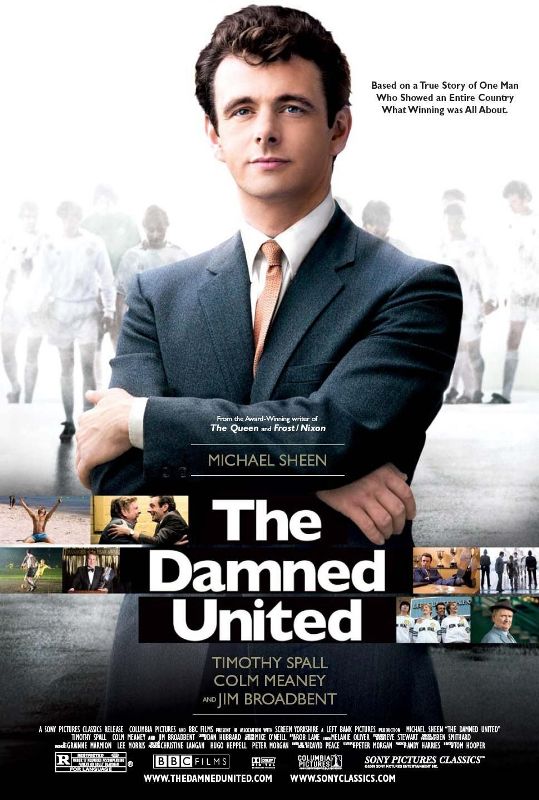
1. The Damned United (2009)
Copyright- BBC Films, Left Bank Pictures, Screen Yorkshire

This film is about the great English football manager Brian Clough, who had a glorious career with average football teams. This 2009 sports drama Michael Sheen on the lead and he himself was on the cover, posing like a true manager. Cover looks stylish and meaningful. There are straight lines through the mid-area of the poster emblemed with different stills from the movie. Typical English poster!

TPW Rating- 4/5

2. The King's Speech (2010)
Copyright- UK Film Council, See-Saw Films, Bedlam Productions
The King's Speech is the pathway film for Tom Hooper. This David Seidler written 2010 drama won Hooper Best Director Award at Academy Awards. Film won four of them in total at Oscar. This critically and commercially successful film had some great covers. Among those the presented one at the site is the bench marker. It kind of gives an impression about the story. Deep yellow background and red font colors has mixed quite well and audience start to guess immediately that the film may be a jolly minded one or a comedy maybe. Which is somewhat true you would know when you see the film.

TPW Rating- 4.5/5  
   
3. Les Miserables (2012)
Copyright- Relativity Media, Studio Canal, Working Title Films, Cameron Mackintosh Ltd. 
With a sensational ensemble cast, this epic drama proved to be a successful film by Hooper. Based on 1862 novel by Victor Hugo, Les Miserables proved to be a great film at Academy Awards, as it received eight nominations and won three of them. There were individual posters for individual characters. But an ensemble poster was chosen for rating. It's typical poster and looks like a studio based film with big stars dazzling.

TPW Rating- 3/5
4. The Danish Girl (2015)
Copyright- Working Title, Pretty Pictures, Revision Pictures, Senator Global Productions
Film is based on real life events of Lili Elbe, first recipient of sex reassignment surgery. As Hooper is a specialist on Autobiographical films, it's sure that the film would come out really good. Eddie Redmayne returns to this film after his Academy Award winning film Theory of Everything and is co-joined by Swedish actress Alicia Vakander. Poster released months ago and looks classy and colorful! It gives a nostalgic impression of bygone era. Redmayne looks perfect for his role.

TPW Rating- 4/5