Showing posts with label album. Show all posts

Monday, January 11, 2016

05 Top Album Covers from David Bowie Discography

The legendary musician David Bowie departs with a great career behind him. Throughout his career he had been one of the greatest and most popular British music figure in the Earth. His musical contribution is unparalleled to many of his time. Bowie culturally influenced generation after generation and created pop phenomena. On 8th January, 2016 Bowie released his final album named Blackstar and only after two days, on 10th January, 2016 Bowie died of cancer after suffering for 18 months.

The Poster World present it's tribute to this great artist by revisiting five of the best album covers from his glorious career.

1. The Rise and Fall of Ziggy Stardust and the Spiders from Mars (1972)
Copyright- RCA Records
This fifth concept album by David Bowie is named after a fictional rock star named Ziggy Stardust. The cover for this album was really fascinating if we take notice of the time. Old, colorless buildings with dark clouds on piece of sky used as the background, most probably to build the inner of that fictional rock star. Mysterious and enchanting!

TPW Rating- 4/5
       
2. Diamond Dogs (1974)
Copyright- RCA
This eighth studio album by Bowie is also a concept album. You can see three human beings are somehow converted to dog. If you see the full cover (which is not shown on this cover) you would see Bowie himself had a pair of dog-like legs. This controversial artwork was done by Belgian master artist Guy Peellaert. It created buzz because on the main cover somehow the genitalia of one character was visible, which later was removed. But whatever the controversy is the cover looks brave and post modern.

TPW Rating- 3.5/5
   
3. Station to Station (1976)
Copyright- RCA Records
Regarded as one of the most important album by Bowie, Station to Station is his 10th studio production. The cover of the album was taken from a Bowie starrer film named The Man Who Fell to Earth, directed by Nicolas Roeg. As album artwork it looks fabulously intriguing.

TPW Rating- 4/5
   
4. Tonight (1984)
Copyright- EMI America
This is the 16th album by David Bowie and released on 1984. This cover shows Bowie gazing towards ceiling with a colorful flowery background behind him. Things match quite good and creates a romantic feel all in all. Subtle and beautiful!

TPW Rating- 3.5/5 

5. The Next Day (2013)   
Copyright- ISO and Columbia
Bowie returned with his 24th album after a 10 years break from music. This cover is quite significant because this is an adapted version of another album cover by Bowie. 39 years ago, on 1977 Bowie released his album Hero and it had the cover of young David Bowie. With The Next Day, Bowie wanted to step into the nest chapter of his career and that's why it was named so. Intelligent and emotional!

TPW Rating- 4.5/5  

Sunday, January 3, 2016

04 Dreamlike Album Art from Baroness

Baroness is an American heavy metal band originated from Virginia and established on 2003. Many members of the band actually united under Baroness when almost all of them came from two other bands named Johnny Welfare and Paychecks. In last 12 years they have produced 04 fine music albums with critical and popular success. Along with the music, album artworks of Baroness also have generated massive praise. Last 18 December 2015, Baroness released their album no.4 Purple.

The Poster World brings to you all 04 dreamlike artworks from Baroness.   Artworks of all o4 albums were created by the Vocal and rhythm guitarist of the band John Dyer Baizley.  

1. Red Album (2007)
Copyright- Relapse Records
Artwork from Baizley is really remarkable. Use of red, background, birds, human body shapes along with blank expressions make this cover an amazing one. This theme was followed on later album covers too.

TPW Rating- 5/5
  
2. Blue Record (2009)
Copyright- Relapse Records
Another similar composition by Baizley. Again use of two figures blended with the color mentioned on album name. Use of nature with two beautiful ladies making this cover a celebration of art.

TPW Rating- 5/5

3. Yellow & Green (2012)
Copyright- Relapse Records
This time Baizley gets bit violent. There are human figures with few flamingos surrounding them. One lady is carrying flamed candle on her head, a sword on her hand and another's head is pinned. Mysteriously haunting!

TPW Rating- 4.5/5

4. Purple (2015)
Copyright- Abraxan Hymns
Another artwork inspired by the influence of nature. There are animals, flowers, sky lines and flowers all around 04 naked human figures. Baizley illustrated a perfect blend of his thought and with this cover really established his own language on art. Beautifully moving!

TPW Rating- 5/5

For more artworks from John Dyer Baizley you can visit- A Perfect Monster

Thursday, December 24, 2015

04 Bizarre Album Covers from Cage the Elephant

On the year 2006, American rock band Cage the Elephant was originally formed in Kentucky. First album by the band named 'Cage the Elephant' was released on 2008 and achieved success. The band is famous for it's own rock-funk genre of music. All four of the albums have different approaches to music. In 2015 Cage the Elephant was nominated at Grammy Award for Best Alternative Music Album. This December 18, band released their fourth album named Tell Me I'm Pretty. The Poster World presents to you all 04 of the album covers from the discography of Cage the Elephant.

1. Cage the Elephant (2009)
Copyright- RCA/Jive
This debut album by Cage the Elephant was named on the band's title. They chose an unusual artwork for the cover. The use of color and font is also quite atypical. Bit dark and surreal!

TPW Rating- 3.5/5   

2. Thank You, Happy Birthday (2011)
Copyright- Jive
Another unfamiliar and weird album artwork. Though it looks a childish illustration but it actually is quite interesting. Album name on the below with correction makes this cover really funny.

TPW Rating- 3.5/5

3. Melophobia (2013)
Copyright- RCA
Designed by prominent graphic illustrator R Clint Colburn, this third album cover from the band really is a change of idea from the previous albums. Colburn prepared few shapes and chose one from them. The shape was placed on a monochrome and photographed with a striped background. The facial color of the shaped figure gives us an impression of previous artworks by Cage the Elephant.   

TPW Rating- 5/5

4. Tell Me I'm Pretty (2015)  
Copyright- Easy Eye Sound
Band vocal Matt Shultz & designer Meghan Foley prepared the artwork of this newly released album. Expression of the lady on the front of the cover actually steals the show. There are presence of certain depression and unearthly look on the face. Really odd and eccentric!

TPW Rating- 5/5

Sunday, December 6, 2015

07 Surreal Album Covers from Coldplay

Top British rock band Coldplay was formed in 1996 with it's lead vocalist Chris Martin and guitarist Jonny Buckland. Through the University years, both of them been busy organizing the band. Name of the band changed twice. At the very beginning the band's name was Pectoralz. Later it became Starfish and finally named as Coldplay.   

Coldplay is a commercially and critically successful band. They have topped charts from their launching album. The band achieved many music awards including Brit Awards and MTV Video Music Awards. They are also engaged in many social organizations like Oxfam and Amnesty.    

1. Parachutes (2000)
Copyright- Parlophone
This commercially successful debut album by Coldplay had a photograph of globe as cover. Globe that was bought from retailer shop WHSmith. The picture was taken on a disposable Kodak camera. With a dark background this lighting globe looks weirdly beautiful.

TPW Rating- 4/5

2. A Rush of Blood to the Head (2002)
Copyright- Parlophone
If you haven't seen it before you should know that this cover art got a cult fame. The whole idea was arranged by Sølve Sundsbø, a Norwegian photographer. Vocal Chris Martin saw a photograph by Sundsbø on a music based magazine named Dazed & Confused at first. Then Martin wanted the permission of Sundsbø to use the photograph for using it as cover of this album. Sundsbø gave the permission and had a rework with the cover as all band members' head were scanned. The cover was chosen by Royal Mail for postage stamp, for set of the 'Classic Album Cover'.   

TPW Rating- 5/5
     
3. X&Y (2005)
Copyright- Capitol, Parlophone
Mark Tappin and Simon Gofton, the celebrated graphic designers done the artwork for X&Y. The image we see as cover of the album is nothing but a graphical interpretation of Baudot Code, which is a form of telegraphic communication using 1 and 0. Cool colors were used on fonts and image.

TPW Rating- 4/5  


4. Viva la Vida or Death and All His Friends (2008)
Copyright- Capitol, Parlophone
Again a surprising artwork by Coldplay. This piece of cover was designed by one of the ex-collaborators, Tappin Gofton and Coldplay. It took a long time to finish the cover as it was developed from different sketches and paintings. The title itself looks like part of the painting and really creates a rebellious scenario.

TPW Rating- 4.5/5

5. Mylo Xyloto (2011)
Copyright- Capitol, Parlophone
Another exotic design from Coldplay! The cover was highly inspired by graffiti works. The bad had an extensive research and homework on graffiti design, and they even were in search for a graffiti teacher who could teach them about this specific art medium. There is a sharp contrast in color between this cover and the previous one of Viva la Vida or Death and All His Friends. This cover uses more of a raw and exciting colors. Fonts are great too!

TPW Rating- 4.5/5   

6. Ghost Stories (2014)
Copyright- Atlantic, Parlophone
This cover by Coldplay is bit simplistic than the previous ones. Subject of the cover is extraordinary! A pair of wings (of angel's most probably) were used in front of the widespread sea and sky full of stars. Artwork was well executed by Czeck artist Mila Furstova. This album is full of arts and sketches by this great artist.

TPW Rating- 5/5 

7. A Head Full of Dreams (2015)
Copyright- Atlantic, Parlophone
The marketing for this album was really creative as the central geometric pattern of the cover (named as Flower of life) was all where on the London Underground. It had a tiny note- December 4. You get it right. It's the release date of the album. Cover has a surreal feel and used rich colors.

TPW Rating- 4.5/5  

Saturday, November 21, 2015

03 Album Covers from Adele Discography

Adele is a popular and acclaimed singer-song writer of British origin. Her career kick started when one of Adele's friend posted a demo of her singing on Myspace on 2006 and since then the rest is history. After a commercially and critically successful demo album named 19, she never had to look back. She achieved extraordinary successes throughout his career by acquiring almost all possible awards and also wrote her name on Guinness Book of World Records.

The album covers of Adele are quite simple as those actually depict only the facial expressions of her. But also express her age and maturity as a singer and celebrity. The Poster World brings to you all three of her album covers and rate them as per the total output.  

1. 19 (2008)
Copyright- XL Recordings
Adele released her first album 19 on 28th January, 2008 with great commercial and critical success. Songs like 'Chasing Pavements','Hometown Glory' and many more topped charts on many countries of the World. At the age of only 19, she gained instant fame and awarded on different ceremonies. After this album many critics were assuming the World is getting it's new International star. The cover design of the first album doesn't show the full faced Adele, instead it does give an impression of a calm and quiet Adele. Obviously for any woman 19 is an important age, as it is a transition period when a girl turns into woman. That's a possibility for the down to earth look of her. It's mystique and subtle.

TPW Rating- 3.5/5
 

2. 21 (2011)

Copyright- XL Recordings and Columbia Records
During the production process of this second album by Adele, she was suffering from personal problem as during that time she had broke up with her boyfriend. But as the album ultimately finished, it became another commercial and critical success. The album also made it's name on Guinness Book of World Records by topping UK Top Chart with two two consecutive albums and songs. Again on the cover Adele looks like on a restful mood and looking down as before. Black and white face of Adele makes the album look like a little bit desolate and tragic. Fonts are really good.

TPW Rating- 4/5
      
3. 25 (2015)

Copyright- XL Recordings
Third album by Adele wouldn't have been possible if she hadn't change the decision of quitting music industry. She was going through a long patch of non-creativity and couldn't write songs for a long time. It took some time to reset Adele's mind to do music again. The album released on 20th November 2015 and gained commercial success. Her song 'Hello' released on October and was an instant success with 436 million hits on Youtube for the video (by the count on 21st November 2015). Another simple cover by Adele with her face straight to the listeners and audiences. Does it mean maturity or presence with a certain personality? May be.

TPW Rating- 4/5 

Wednesday, November 11, 2015

05 Album Art from Laura Marling Discography

25 year old Laura Marling is a prominent British folk artist creates music as well as lyrics with sheer ingenuity. A childhood music learner started her career early at the age of 16, when she moved to London. She joined a the-then musical movement publicized by the name 'nu-folk'. Soon Marling joined Noah and the Whale, and became a background vocal. But she left the band on 2008 for personal reasons. Same year Marling released her first album and she never had to look back again. From 2008 till 2015 she released 5 albums and all were more or less successful.

The Poster World presents to you all 5 album covers from Laura Marling discography started from the first album Alas, I Cannot Swim to the last one Short Movie.

1. Alas, I Cannot Swim (2008)
Copyright- Virgin Records

This Mercury Music Prize (2008) nominated debut album by Marling was critically and commercially successful. The view of Marling about the album was it's about being on the age of 18 or 19 and falling in love. Cover of this album is brightly colorful and represents many living beings or objects. Though the album title is absent from the front cover, with this amount of illustration it makes a good cover.

TPW Rating- 4/5

2. I Speak Because I Can (2010)
Copyright- Virgin Records
A fall from the colors of the first album, but she kept her naming fonts as colorful. This album represents a more mature Laura Marling as her point of view about the album is that it deals with responsibility of Womanhood. The cover also resembles the growing up of Marling. Feminist tone of the album title mix perfectly with the expression of Marling on the cover.

TPW Rating- 4/5  

3. A Creature I Don't Know (2011)
Copyright- Virgin

Third album by Marling also went on to achieve positive reviews and good rank on UK Top Chart. Another experimental cover design from Marling. We see two bodies almost attached to each other but it creates a surreal unearthly feel about it. It gives an impression that we are trying to surpassing each other on this World's nude reality. Font design is also very simple and catchy.

TPW Rating- 4.5/5

4. Once I Was An Eagle (2013)
Copyright- Virgin

The most acclaimed album by Marling is also one of the best album of 21st century by a vocal and song writer. Probably the cover also showed the ambition. Because she seems trying to reach for the stars. It's all about Marling on the cover with her half bare back and blond hair. Stunning and brave!

TPW Rating- 4.5/5 
5. Short Movie (2015)
Copyright- Virgin
Latest album by Marling is a departure of her from folk genre. The cover we see is a sketch by Marling herself. The whole idea of this album was deeply inspired by her living on Los Angels for few days, which reflected on her songs also. Cover is a minimalist one, use of color is good and fonts are also OK. 

TPW Rating- 3/5            

Tuesday, October 20, 2015

City and Colour Discogrpahy on 05 Mindboggling Covers

This 9th December 2015 City and Colour released it's fifth album titled 'If I Should Go Before'. City and Colour is a one man band consisting of Mr. Dallas Green. Green started his musical career with a band named Helicon Blue. Later he joined a post-hardcore band named Alexisonfire. After that Green started releasing his songs on Internet and later he compiled almost all of these songs to release as his first audio album. Songs of City and Colour are highly motivated by it's lyrics and stylist acoustic approach.

The Poster World (TPW) looks into all the album covers by City and Colour, and tried to give ratings for those album.

1. Sometimes (2005-07)
Copyright- Dine Alone Records

The album cover looks more like a logo of an insurance company. But the sparrow like bird looking towards the skyline and all those arrangements around it on the cover, make it colorful and charming. Faded Grey-greenish background helps the bird in front to truly lighten up itself.

TPW Rating: 4/5   

2. Bring Me Your Love (2008-09)
Copyright- Dine Alone Records, Vagrant, Shock
This second album by Color and City was more of a folk oriented album. Instruments like bass, harmonica and banjo were used on the songs. This album art has similarities with another album cover art by Iron & Wine. This cover actually depicts the central figure behind the band- Dallas Green. Somehow this peaceful imagery blends with the songs of the album.

TPW Rating: 3.5/5   


3. Little Hell (2010-12)
Copyright- Dine Alone Records, Vagrant

Yes this looks like a surreal imagery but believe me it is not. It's nothing but a tulip field situated outside of Alkmaar, Holland. But this art is actually taken from an Allard Schager's photo named 'Fields of Gold'. Not sure if anyone ever used this kind of album cover ever. But it is really glorious and enchanting!

TPW Rating: 5/5  

4. The Hurry and the Harm (2013)
Copyright- Dine Alone Records, Cooking Vinyl 
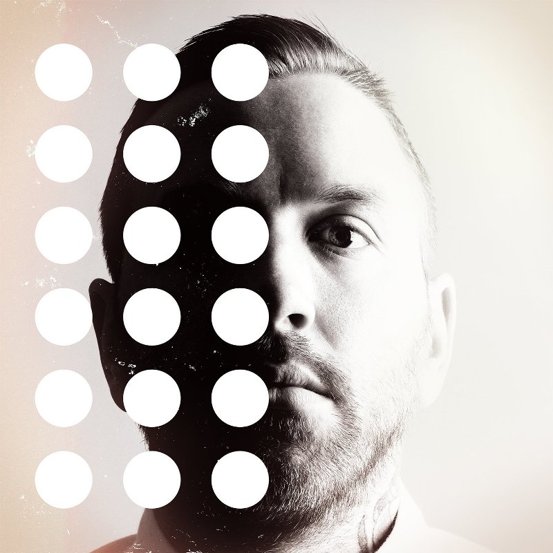
Again on a cover we can see Mr. Dallas Green. This time he is facing the audience straight. It looks like a vintage album cover with the black and white tone of it. It seems like the band gone totally opposite of it's previous work.  Not as classy as previous covers.

TPW Rating: 2.5/5

5. If I Should Go Before You (2015)
Copyright- Dine Alone Records
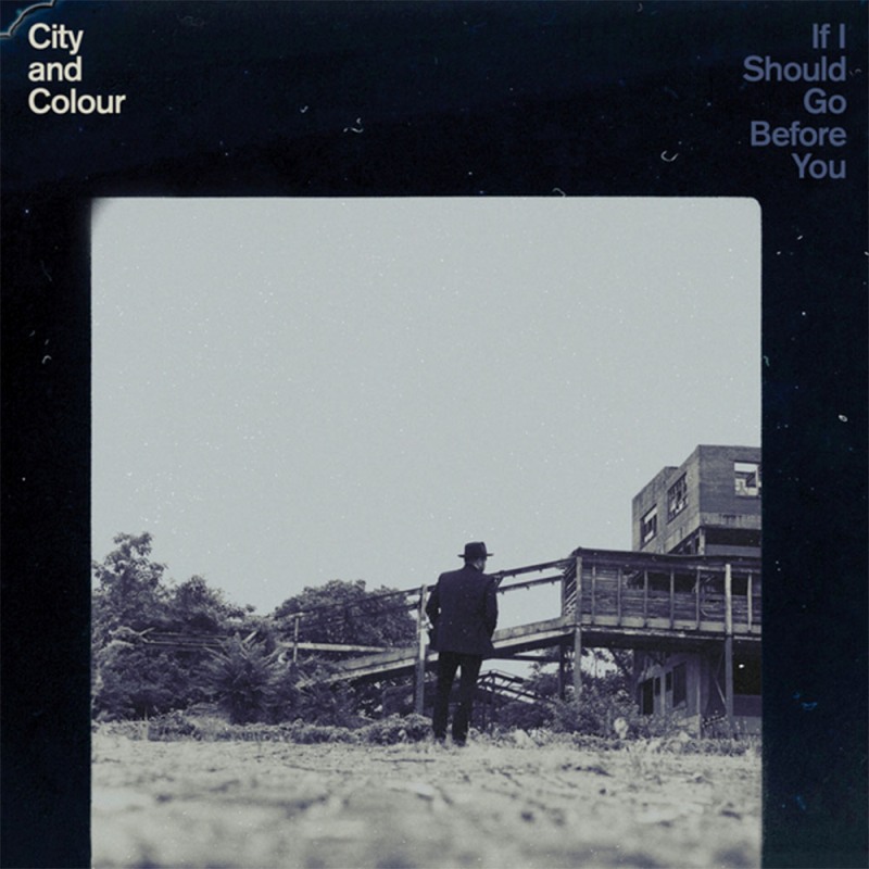
This time Mr. Dallas (hope it's him) is showing his back in front of listeners. A certain subtleness is present on the picture with suited booted Mr. Dallas and a house from 17th Century I guess. The whole idea almost repeat it's black and white tone of previous album. Little fonts are catchy and simple.

TPW Rating: 4.5/5  

Saturday, October 3, 2015

03 Great Album Covers from Mumford & Sons Discography

Critically and commercially acclaimed Mumford & Sons is a British band concentrates their music on alternative rock and folk rock genre. Four members of this band have very good hand on different types of musical instruments and it reflects on their music also. With the first album Sigh No More (2009), Mumford & Sons achieved Brit Award for Best British Album in 2011. Their next album Babel (2012), won prestigious Album of the Year on Grammy Awards. As a band Mumford & Sons have made their name with exquisite lyrics and soothing use of instruments and music.

The Poster World would bring to you album covers from 03 released albums by Mumford & Sons.

1. Sigh No More (2009)
Debut album by Mumford & Sons. Cover was taken from the front side of a furniture store on famous King's Road, London. Few of the mad followers of the band are always present at this particular shop. Four of the members are present there on the window and if you take a close close look you would see there is someone on the left window on the first floor. OK. Do they want to mean something we don't know? Who knows? Whatever, the cover is cool and should say 'simplicity at it's best'.

TPW Rating: 5/5
  

2. Babel (2012)
What is this babel thing? It means a confused kind of noise, which is typically made by few voices. Few voices? I guess it could be a band. Previous cover of the band had a mysterious face into it; the same goes on with this poster. Look at the background. All the human face are blurring but look closely to the left window. Yes, a face is looking straight at the camera like the band. It could be the face of the producer Markus Dravs or may be someone else. As a whole the poster is puzzling and composed.

TPW Rating: 5/5 

3. Wilder Mind (2015)
 
This is a minimalist approach on the cover by the band. An empty bench. It is an album where they wanted to get free from the traditional acoustics and from folk genre they were used to play. They left their long term producer Markus Dravs on the way. Does this cover (with the bench) represent the idea that they are actually leaving their roots and staring towards cityscapes? May be, may be not. Cover is refreshing and says a lot by not saying. 

TPW Rating: 5/5

Wednesday, September 23, 2015

Noah and the Whale Discography on 04 Amazing Posters

Few years back, some of the friends from Twickenham, London were actually enjoying an Indie movie named 'The Squid and The Whale', directed by upcoming new director Noah Baumbach. After the movie finished it immediately became their most favorite movie. They wanted to do something with this exquisite experience. As they were friends and have massive ambition with music, they tried to name their band with the film's name. Instead they chose the first part of director's name and the last part of his movie's name, and named it 'Noah and the Whale'. That's how their little story of 'Indie' success began. Little because they split up recently. Noah and the Whale had created a lot of buzz among young music fans among the world, mostly because of their fresh style of music and youth oriented lyrics. They not only enchanted with music and lyrics, as their album cover also been really catchy. The Poster World (TPW) brings you here 04 really cool album covers of Noah and the Whale.

01. Peaceful, the World Lays Me Down  (2008) 
Peaceful, the World Lays Me Down
This debut album by Noah and the Whale was well received and earned a spot on UK singles top chart. One word to describe this album cover is it's 'peaceful'. Looks like it's kind of a park and there are couple of trees. We can't quite understand those human like figures as those are painted with some 'hard to understand' ideas. It looks good, fonts are catchy but bit complex overall.

TPW Rating: 2.5/5 

2. The First Days of Spring (2009)
The First Days of Spring
This critically acclaimed album raised the popularity of Noah and the Whale by miles. The album cover for this album was really great as it had a fresh Indie look with some questions also raised. Mr. Fink, one of the member of the band, upfront, with a telescope or something and he also is the only focused man on the cover as other members are out of focus behind. Is it indicating that Fink and his personal life inspired this album a lot? May be. May be not.

TPW Rating: 5/5            

3. Last Night on Earth (2011) 
Last Night on Earth
This third album by the band topped the UK chart again and found number 8 position. Music wise it's bit different album than previous ones, because those one's didn't have a song like L.I.F.E.G.O.E.S.O.N. If you haven't listened it yet, please do. The song is really inspiring. Album cover is the most stylish among others. Use of space and different shape of fonts also give a smart modern look to it. Look below, it also has something to do with the road.

TPW Rating: 4/5

4. Heart of Nowhere (2013)
Heart of Nowhere
The fourth and last album by the band before splitting up. This album also gave a half hour of short film with the album. Look at the cover. It's like people are on the suits of astronauts. Background color is quite similar of the previous album. This cover has a calm, subtle thing about it, also it gives an weired impression.

TPW Rating: 4/5      

Thursday, July 23, 2015

Passenger Discography in 06 Magnetic Album Covers

A band named Passenger actually emerged to British music arena on 2003, when a guy named Michael David Rosenberg teamed up with another guy named Andrew Phillips in a quite place in Britain named Brighton. As a multiple member band, at the year 2007 they released their first album by the name Wicked Men's Rest and that's it! They broke up afterwards. Rosenberg decided to make a single career and chose the stage-name 'Passenger' to break into the industry. Since then Rosenberg aka. Passenger rewrote the history of modern folk rock. His 06 albums are rich of folk or Indie rock tracks and generally have highly positive reviews around the World.

The Poster World would look into all the album artworks by Passenger (the solo Rosenberg one) as all of their artworks are hypnotic and bit surreal. Let's have fun with some amazing arts.

1. Wide Eyes Blind Love - 2009
Debut album by Passenger 'Wide Eyes Blind Love'
[Copyright-Passenger]
A crow is caught in the middle of a life and death situation. Crows have been a favorite subject for Mr. Rosenberg as on a later artwork he again used a crow. But look at this crow. Does Rosenberg meant himself as the crow as his songs of this album been bit depressing (though i didn't feel so)? There is a possibility he might be going through a transition with his career at that time and it reflected on the cover.

2. Divers and Submarines - 2010
Deep down the sea level
[Copyright-Passenger]
This cover is really amazing! Look at the color and all kinds of stuff from deep sea. The cover actually has the power to force you to buy the album, not a matter if you have or haven't heard previous albums. Mr. Rosenberg is an avid art enthusiast and he made sure that his cover should as soft and easy his songs. This super cool cover artwork really made me to write about the album covers of Passenger.

3. Flight of the Crow - 2010
Crow and Suitcases
[Copyright- Passenger, Inertia]
The start of the joint cooperation by David Rosenberg himself and brilliant artist Sarah Larnach, for all of the next album covers. You don't have to be a rocket scientist to understand the magical brilliance of this cover. It's just exquisite in every possible sense. Look at the shapes, colors and gravitational placements of those suitcases. Look at the big crow carrying a long grass or something like that. Even that unknown thing is colorful. The fonts of the artist name is same as the previous cover, but the placement of that name is great.

4. All the Little Lights - 2012
There are mysteries behind little lights
[Copyright- Black Crow]

Another beautiful work by Sarah Larnach. She says on her blog that, the real cover is not just a flat image, but it is made of 5 different painted layers and also outlines. The whole process generation for this cover art was inspired by the printmaking she did on her art school. There were also some extra papers with this album, where Larnach drew few lightening images, So all are not only little lights.

5. Whispers - 2014 
Whispers I
[Copyright- Black Crow]
This is probably one of the best album covers you would see in recent times. This whispering tells more and more than it actually shows. Larnach speaks out on her blog about the cover and says that Rosenberg came up with the idea at first and they cemented that idea with inspirational books from writers such as Blyton, Potter, Dick & Jane books. She also says that she got spoiled as she was working with such clever musicians who care about every aspect of their craft.

6. Whispers II - 2015
Whispers II
[Copyright- Black Crow]
Another classic cover by Sarah Larnach. It's the second edition of Whispers after the previous got huge acclaim worldwide. But this second edition was prepared to help the UNICEF by the profit margin of this album. The lady sitting on the bench was inspired by Larnach's own mother, who actually posed for this cover. Larnach wanted to make sure looks like 20. I am sure she is successful. Nice color, simple and beautiful artwork.   

Monday, July 20, 2015

14 Rocking Duran Duran Album Covers - Part 01

Duran Duran is one of the most influential and popular rock/pop band of not only UK, but also has fame among genuine pop lovers around the world. They were one of the most important bands of the MTV generated 'Second British Invasion' in Eighties. There are hints from different marketing point of view that they have sold more than 120 million records worldwide. Duran Duran was fashionable, free minded and liberal with nudity on their music videos. But they were also very ambitious as at that time they started shooting videos with 35 mm. They also established big screen projection on their concerts. Though the band's future was fading on late Nineties, they emerged gloriously and the old 5 members reunited big time. Still Duran Duran winning hearts of millions.

The Poster World would dig into all 14 studio albums by Duran Duran and their coming of age cover art works. On this first part we would discuss about their first 5 album covers from the self-titled debut album.

1. Duran Duran, 1981
Self-titled: Duran Duran
The first thing came to my mind after seeing this album cover was the famous poster of 'A Clockwork Orange'. May be it's bit inspired from that (or may be not). Fashion of Eighties is all over the band members look and dress up. They are standing, facing the camera with different style and trend of that time. Look at the red car and also the red background used. White and black dresses are really engaging a good chemistry. A regular classic cover.

2. Rio, 1982
Remember the lip of 'RIO'
Who is this girl anyway in the cover? This is my first impression after seeing the art work. An ever smiling face. A face you would fall in love easily. Obviously people felt in love with the music of the album. It became one the best British albums ever on different polls. It became so famous that even after thirty plus years the album was seen in a recent release of Tom Cruise named Oblivion. The cover is haunting yet keeping some mysteries on that smile.

3. Seven and the Ragged Tiger, 1983
Tiger based 'Seven and the Ragged Tiger' 
Not only it's a tiger themed album, the cover of it is also quite inspired by tigers. We can see tiger's parts on different corners of the album. The album name originally came from the idea that there are 5 members and 2 managers, so it would be seven and the ragged tiger is the other name of success. The album design also get inspired by these ideas, though the managers are not present on the cover. Or may be they are present by some symbols.  

4. Notorious, 1986
Bit gay cover of 'Notorious'
Inspired by the great film director Alfred Hitchcock and his movie names (like Notorious), this is Duran Duran's fourth album saw the light of a release after many difficulties surrounding the membership of the band. The cover art emphasized on only three members of that time excluding couple of former members. Though their look looks bit gay but in Eighties this cover was probably a super cool stuff.

5. Big Thing, 1988
Look at the Color and font size of 'Big Thing'
One of the big reasons behind the name 'Big Thing' is probably the big change in Duran Duran's musical pattern. In late Eighties the total musical scenario was changing, as more of a groove based ones, dance based music was becoming popular. Duran Duran chose that path and this decision in future would cause a fatal outcome. The font is not attractive at all on this cover. Colors are good but doesn't give a single information about the album. A below average cover in my opinion.

(To be continued)