Monday, August 31, 2015

Roman Polanski Series - 06 Amazing Posters of Repulsion

I can recall, it was one of the last days of film school and my teacher was telling something about Polanski's 'Repulsion'. Suddenly the teacher asked me to name one thing of the protagonist that actually attracted people blindly to her. I guessed right. It was her blond hair. That's my introduction to the deep,fascinating as well as puzzling world of Repulsion.

This is the first film of Roman Polanski's great 'apartment Trilogy'. It tells the story of a blond young girl, who is alone on her apartment because her sister went to a vacation. But in the mid-time that young girl starts having some weired traumas around her.

There were various posters made for this film, for obviously the various locations of release for this film. With mainstream British release, there were Hollywood release, many from the festival circuits and obviously many made by the fans. The Poster World would celebrate 50 years of this great movie by enjoying different posters of this great classic. Let's get Repulsed!

1. The Popular One-
'Yaap! The screen's shocking reality!'
The most popular and marketed poster of Repulsion is basically a very well made one. Look at the straight razor and multiple faces of a blond woman around it. Faces have different reactions as it depicts or gives a hint that the girl probably is heading with different emotions. The thing that it is actually a gender based film, sexuality may be the main center point here, because to make sure that the poster maker was aware to show signs of male and female gender on the film title. Look at the background. The color of the background is light pink and by pink we know what it actually means. Don't we? 
 
2. Where Girl's Hair is Prominent- 
'Gaze everywhere'

Yes, the first thing I was attracted from this poster is the blond hair of the girl. Look, it's the first thing you would notice. Yes, it actually tries to say you something, and unfortunately you would only realize the contribution of hair when you see the film. There are two male heads with front faces behind the protagonist character, and they have different gazes. A blood cut went around one corner of one face to another corner of another face. It definitely ensures there are sufficient blood presence on the film.     


3. What's for Food-
'Meat'

I don't want to get into what's on the plate, but there's definitely meat, and meat what it's all about on the film. Look there also is a sharp razor to cut the meat. A hand is present there on the dark background. Hoping for some help I guess. The poster isn't actually overwhelming but has a minimalist approach compared to other posters. 


4. Another Popular Poster-
'Grey Hands'
This is another popular and highly marketed poster of the film, where a girl seems like floating on air and there are two hands on her body. The color used on the girl's body and also on the hand (which is bit Grey, same as the main background of the whole poster), is really interesting and intriguing. 


5. Look at the Hair Color-
'... and the razor'
The hair color of the girl on the poster is fascinating and would have been lovely if there was no razor included on it. Oh you missed it! Look closely and you would see a straight razor on it. OK, let's come into the hair color part. It's bit yellow, bit reddish and also has a mixed color of both two colors. Look at her face, it's blue and for this her hair colors are actually like exploding. Impressive poster! 


6. Or Is It All about Eyes-  
'Eyes only'
Here comes my favorite one. The poster says that it's all about eyes; all different eyes. It's black and white, and because of this we can't find the colors inside. But it actually questions us about the ultimate female gaze, how girls look at the world around themselves. It the girl is a virgin blond then she definitely has some extra thoughts. What do you think? 

Friday, August 21, 2015

Poster Review - The Hateful Eight

Quentin Tarantino's 8th film is variedly named as The Hateful Eight/The H8ful Eight/The Hateful 8. It is a dream project by Tarantino, but that dream turned into a nightmare when the film's script leaked and became public. Tarantino immediately decided not to make this a movie, rather change the script to a novel. But after a public reading arrangement of the leaked script this visionary director decided to make feature film again. The film would be ready for a release on the Christmas Day, 2015.

So, how are the posters of one of the most awaited movies of this year have been? Different types of posters are used on different time and occasion for The Hateful Eight. Tarantino released two teaser poster long ago with some gory atmosphere all around. Here are those two posters.

#01
'Obviously bloody'
This first teaser poster is quite simple, as only fonts are speaking and speaking a lot. Look at the 8 of the 'h8ful'. No poster of Tarantino is actually complete without blood. Come on!

#02
'Yes, it's God damn Western!'
Second one is about a revolver or a boot, but both of which actually would explain it as an Western film, obviously with a blood red background. Great one as a teaser poster. 

After these 'above reviewed' posters the production began and Tarantino took some time to release two more posters dedicated to give hints of the storyline and also to show the gory affection of himself.

#03
'Red and white contrast'
Here the first poster is showing a stagecoach running through icy trail and leaving blood behind. White background is actually depicting ice and for that redness of the blood is getting more prominent. Idea is obviously Tarantino styled and it is definitely lovable.

#04
'Storyteller'

This second one is actually telling more than any previous ones. We can see a hilly road, where the blood is abruptly shattered here and there. There is a hut up on the hill and two characters are heading towards the top as some are waiting. This one is really more descriptive and thoughtful.

Two recent posters were also released days ago. So how these posters have been. Let's check.

#05
'Mexican it is'
Here on this package of posters we would meet new characters of the film. This one here is - The Mexican. One by one we would know all the characters as we see eight marks on the background. One Grey one (out of other seven red) actually suggesting that 'look this is the one we are mentioning'. The posters seems bit average to me.    
                
#06
'Promising but...'
Similar to the previous one but it actually looks better. The same formula as here as two of the marks are Grey out of eight. So we are talking about two characters here. One is 'The Hangman' and the other is 'The Prisoner'. With the background of hillside the poster looks promising but bit stereotypical same as one we mentioned earlier.   

(Last update is that there are more posters on the web on the serialization of last two posters)   

Tuesday, August 11, 2015

Best Film Posters of 2015 - Part 2

This year anticipated few very good movies already. Few became box office winners, few Indie hits and also few of the films were sheer disappointments. But posters of almost all of these films have been really cool and classy. It is really a hard job to find out the best ones among them.

The Poster World previously given you the first installment of our search for the best posters of 2015 (Best Film Posters of 2015 - Part 1). Now on this installment we are showing you 05 more exciting film posters of 2015. Let's do it.

1. Me and Earl and The Dying Girl 
Director- Alfonso Gomez-Rejon
Cast- Thomas Mann, Olivia Cook, Jon Bernthal
'Minimalist One'
This teenage Rom-com was based on a book by Jesse Andrews. The film won several awards including few on 2015 Sundance Film Festival and it earned a standing ovation there too. Story consists of a boy named Greg, his friend Earl and the girl Rachel. The film is quite different from other teenage Rom-com films. This poster of the film is quite minimalist, as the main characters are shown beside there names. Fonts are catchy and overall background expressing a light mood. Simple and soft!    

2. Paper Towns
Director- Jack Shereier
Cast- Nat Wolff, Cara Delevingne
'Fonts are too cool'

Another Rom-com on our list of great posters is based on a novel by John Green (who brought us acclaimed 'The Fault in Our Stars'). Tag line of this teenage venture is 'Get lost, get found'. Yes one character goes missing here on the film, and by the effect of which one character finds himself. OK, I probably have given some spoilers. But let's see the poster. The girl here is bit covered by her hair, yes it seems she is hiding something and obviously behind her there is the boy. May be he wants to know what she is hiding. Fonts are very good and gives a teen impression. Liked it!      


3. The Walk
Director- Robert Zemeckis
Cast- Joseph Gordon-Levitt, Ben Kingsley, Ben Schwartz 
'A high angle shot'

Robert Zemeckis brought us great films like Forrest Gump, Cast Away and many more. This time Zemeckis is making a film on the life and events of French high-wire artist Philippe Petit. The poster of the film is really interesting as it gives an impression of watching a 3D movie. We can bird-eye view our main character from a top angle position and look at the buildings on the ground. The poster is brave and chilling!
  
4. By The Sea
Director- Angelina Jolie Pitt
Cast- Brad Pitt, Angelina Jolie Pitt
'With two hats it tells a story'
Another film by Angelina Jolie Pitt after Unbroken (2014). This time she appears as one of the main characters of the film along with his real life husband Brad Pitt. The poster of the film is really good. It has a yellowish flavor all around and in between a male hat and a female hat, one beside another. In front of those hats, a sea or ocean or something like this. The theme is minimal and exotic.   


5. Point Break
Director- Ericson Core
Cast- Edgar Ramirez, Luke Bracey, Teresa Palmer 
Our only action film from this installment has a tag line like 'the only law that matters is gravity'. Yes, the poster is all about gravity. It actually gives bit spoiler. Two 'robin hoodesque' characters, do not have any affection for money, and they have jumped from a god damn plane! The poster is crazy and really really innovative. This one would single handedly provide the producers few millions for sure. 

Monday, August 3, 2015

06 Greatest Haruki Murakami Book Covers

Haruki Murakami is one of the most prominent and important writers alive at this moment. He is Japaneses but his writing and literary fame reached every corner of the World. Millions of books by Murakami were sold and also translated into more than 50 languages. His memorable works include famous books like Norwegian Wood (1987), The Wind-up Bird Chronicle (1994), 1Q84 (2009) and many more. Though he has a worldwide recognition for his novels and short stories, but he is not much rated by many in Japan for his novels. It didn't stop him to write one by one magnificent works of literature.

Like Murakami's books his book covers were also quite surreal and intelligent. The Poster World would dig into 06 different book covers of Murakami published out of Japan.

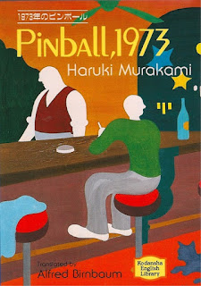
1. Pinball,1973 (1980)
'Bit Direction less'
The cover of Pinball,1973 is an illustration full of colors and bit motiveless. There is a sense that the characters are disconnected and going nowhere. A cat is sleeping at the floor and a towel is lying lazy at a tool. The persons are looking towards very different angels. The first impression I had after watching this artwork was quite similar of what I saw on Salvador Dali's masterpiece work 'The Persistence of Memory'.    

2. A Wild Sheep Chase (1982)
'Let's Find The Sheep'
A detective story about finding a sheep. You saw it correct. Yes, a sheep. This famous novel had some peculiar covers but this one came out as the best one. Face of a sheep, along with a star, beside a forest- that's basically the story of the cover. This is a simple cover but gives an weird and strange impression about everything. Good one!   

3. Hard-boiled Wonderland and The End of The World (1985)
'What's on Your Head?'
The cover of this book is surprisingly beautiful. A snowy town on someone's head is always a great idea to cherish on a book cover. Murakami has a tendency of writing highly surreal stuffs but obviously on a realistic pattern. The cover actually enchants the way Murakami writes, so have to say this is a brilliant brilliant cover!    

4. South of The Border, West of The Sun (1992)
'Magical'
This short novel by Murakami has not gone to usual genre of surreal world and characters. It's a romantic story, filled with nostalgia and hefty sighs. The cover of this edition is really fascinating as it probably is showing one face in two different dimensions. This is creating a magical feel and after reading few hours of Murakami you would feel exactly same.  

5. The Wind-up Bird Chronicle (1994)
'An Evolution'
Very minimalist approach used as the novel tells the story of a guy who's cat ran away from house. Murakami always had fascination with cats and we all know cats are symbol of happiness, comfort and being close. Here the cover of this edition of book is quite interesting, as we can see there are two different types of animals- one cat and another one is bird. A cat is trying to fly and after few attempts it became a bird (or there could be different explanations). The use of red is charming and simply making things alive. Great one! 


6. Kafka on The Shore (2002)
'Kafka Returns'
The story of 'Kafka on The Shore' is about a 15 year old teenager who ran away from his home and about an old man who's main job is to find lost cats. It's obvious that Murakami's writings are highly influenced by great Franz Kafka and by naming one character with the same name actually means a lot to him. The cover is showing a teenager with a sunglass, where in the glass we can see some kind of hills. It's simple, stylish and urban.