This 9th December 2015 City and Colour released it's fifth album titled 'If I Should Go Before'. City and Colour is a one man band consisting of Mr. Dallas Green. Green started his musical career with a band named Helicon Blue. Later he joined a post-hardcore band named Alexisonfire. After that Green started releasing his songs on Internet and later he compiled almost all of these songs to release as his first audio album. Songs of City and Colour are highly motivated by it's lyrics and stylist acoustic approach.
The Poster World (TPW) looks into all the album covers by City and Colour, and tried to give ratings for those album.
1. Sometimes (2005-07)
The album cover looks more like a logo of an insurance company. But the sparrow like bird looking towards the skyline and all those arrangements around it on the cover, make it colorful and charming. Faded Grey-greenish background helps the bird in front to truly lighten up itself.
TPW Rating: 4/5
2. Bring Me Your Love (2008-09)
This second album by Color and City was more of a folk oriented album. Instruments like bass, harmonica and banjo were used on the songs. This album art has similarities with another album cover art by Iron & Wine. This cover actually depicts the central figure behind the band- Dallas Green. Somehow this peaceful imagery blends with the songs of the album.
TPW Rating: 3.5/5
3. Little Hell (2010-12)
Yes this looks like a surreal imagery but believe me it is not. It's nothing but a tulip field situated outside of Alkmaar, Holland. But this art is actually taken from an Allard Schager's photo named 'Fields of Gold'. Not sure if anyone ever used this kind of album cover ever. But it is really glorious and enchanting!
TPW Rating: 5/5
4. The Hurry and the Harm (2013)
Again on a cover we can see Mr. Dallas Green. This time he is facing the audience straight. It looks like a vintage album cover with the black and white tone of it. It seems like the band gone totally opposite of it's previous work. Not as classy as previous covers.
TPW Rating: 2.5/5
5. If I Should Go Before You (2015)
This time Mr. Dallas (hope it's him) is showing his back in front of listeners. A certain subtleness is present on the picture with suited booted Mr. Dallas and a house from 17th Century I guess. The whole idea almost repeat it's black and white tone of previous album. Little fonts are catchy and simple.
TPW Rating: 4.5/5
The Poster World (TPW) looks into all the album covers by City and Colour, and tried to give ratings for those album.
1. Sometimes (2005-07)
 |
| Copyright- Dine Alone Records |
The album cover looks more like a logo of an insurance company. But the sparrow like bird looking towards the skyline and all those arrangements around it on the cover, make it colorful and charming. Faded Grey-greenish background helps the bird in front to truly lighten up itself.
TPW Rating: 4/5
2. Bring Me Your Love (2008-09)
 |
| Copyright- Dine Alone Records, Vagrant, Shock |
TPW Rating: 3.5/5
3. Little Hell (2010-12)
 |
| Copyright- Dine Alone Records, Vagrant |
Yes this looks like a surreal imagery but believe me it is not. It's nothing but a tulip field situated outside of Alkmaar, Holland. But this art is actually taken from an Allard Schager's photo named 'Fields of Gold'. Not sure if anyone ever used this kind of album cover ever. But it is really glorious and enchanting!
TPW Rating: 5/5
4. The Hurry and the Harm (2013)
 |
| Copyright- Dine Alone Records, Cooking Vinyl |
TPW Rating: 2.5/5
5. If I Should Go Before You (2015)
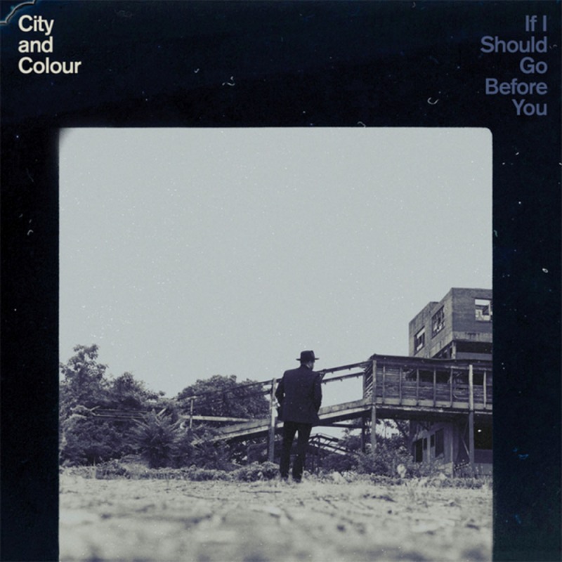 |
| Copyright- Dine Alone Records |
TPW Rating: 4.5/5


