Monday, November 23, 2015

Top 04 Posters from Tom Hooper Films

Academy award winner director Tom Hooper is coming with his new film The Danish Girl (2015) this coming Friday, 27th November 2015. At the age of 12, Hooper decided to become a film director after he got in touch with a book on film and television. After two years Hooper made a film named Bomber Jacket, which got Runner-up on BBC Younger Filmmakers' Competition. Since that time Hooper never had to look back at his career. He made several Television productions and five feature length films.

From the illustrious career of Tom Hooper, The Poster World brings to you four of the best theatrical posters. There are some definite big names among those and let's see how can we rate those films' posters.

1. The Damned United (2009)
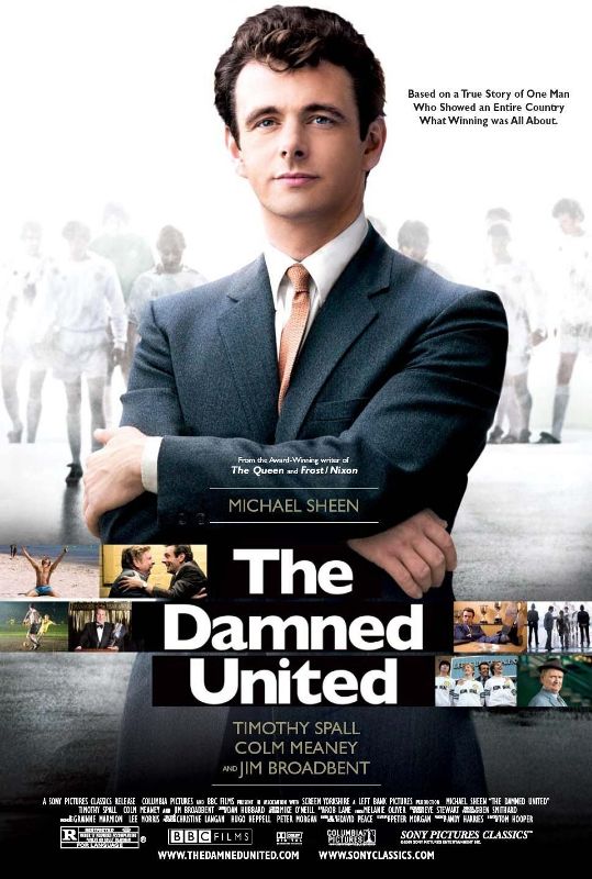
Copyright- BBC Films, Left Bank Pictures, Screen Yorkshire

This film is about the great English football manager Brian Clough, who had a glorious career with average football teams. This 2009 sports drama Michael Sheen on the lead and he himself was on the cover, posing like a true manager. Cover looks stylish and meaningful. There are straight lines through the mid-area of the poster emblemed with different stills from the movie. Typical English poster!

TPW Rating- 4/5

2. The King's Speech (2010)
Copyright- UK Film Council, See-Saw Films, Bedlam Productions
The King's Speech is the pathway film for Tom Hooper. This David Seidler written 2010 drama won Hooper Best Director Award at Academy Awards. Film won four of them in total at Oscar. This critically and commercially successful film had some great covers. Among those the presented one at the site is the bench marker. It kind of gives an impression about the story. Deep yellow background and red font colors has mixed quite well and audience start to guess immediately that the film may be a jolly minded one or a comedy maybe. Which is somewhat true you would know when you see the film.

TPW Rating- 4.5/5  
   
3. Les Miserables (2012)
Copyright- Relativity Media, Studio Canal, Working Title Films, Cameron Mackintosh Ltd. 
With a sensational ensemble cast, this epic drama proved to be a successful film by Hooper. Based on 1862 novel by Victor Hugo, Les Miserables proved to be a great film at Academy Awards, as it received eight nominations and won three of them. There were individual posters for individual characters. But an ensemble poster was chosen for rating. It's typical poster and looks like a studio based film with big stars dazzling.

TPW Rating- 3/5

4. The Danish Girl (2015)
Copyright- Working Title, Pretty Pictures, Revision Pictures, Senator Global Productions
Film is based on real life events of Lili Elbe, first recipient of sex reassignment surgery. As Hooper is a specialist on Autobiographical films, it's sure that the film would come out really good. Eddie Redmayne returns to this film after his Academy Award winning film Theory of Everything and is co-joined by Swedish actress Alicia Vakander. Poster released months ago and looks classy and colorful! It gives a nostalgic impression of bygone era. Redmayne looks perfect for his role.

TPW Rating- 4/5 

Saturday, November 21, 2015

03 Album Covers from Adele Discography

Adele is a popular and acclaimed singer-song writer of British origin. Her career kick started when one of Adele's friend posted a demo of her singing on Myspace on 2006 and since then the rest is history. After a commercially and critically successful demo album named 19, she never had to look back. She achieved extraordinary successes throughout his career by acquiring almost all possible awards and also wrote her name on Guinness Book of World Records.

The album covers of Adele are quite simple as those actually depict only the facial expressions of her. But also express her age and maturity as a singer and celebrity. The Poster World brings to you all three of her album covers and rate them as per the total output.  

1. 19 (2008)
Copyright- XL Recordings
Adele released her first album 19 on 28th January, 2008 with great commercial and critical success. Songs like 'Chasing Pavements','Hometown Glory' and many more topped charts on many countries of the World. At the age of only 19, she gained instant fame and awarded on different ceremonies. After this album many critics were assuming the World is getting it's new International star. The cover design of the first album doesn't show the full faced Adele, instead it does give an impression of a calm and quiet Adele. Obviously for any woman 19 is an important age, as it is a transition period when a girl turns into woman. That's a possibility for the down to earth look of her. It's mystique and subtle.

TPW Rating- 3.5/5
 

2. 21 (2011)

Copyright- XL Recordings and Columbia Records
During the production process of this second album by Adele, she was suffering from personal problem as during that time she had broke up with her boyfriend. But as the album ultimately finished, it became another commercial and critical success. The album also made it's name on Guinness Book of World Records by topping UK Top Chart with two two consecutive albums and songs. Again on the cover Adele looks like on a restful mood and looking down as before. Black and white face of Adele makes the album look like a little bit desolate and tragic. Fonts are really good.

TPW Rating- 4/5
      
3. 25 (2015)

Copyright- XL Recordings
Third album by Adele wouldn't have been possible if she hadn't change the decision of quitting music industry. She was going through a long patch of non-creativity and couldn't write songs for a long time. It took some time to reset Adele's mind to do music again. The album released on 20th November 2015 and gained commercial success. Her song 'Hello' released on October and was an instant success with 436 million hits on Youtube for the video (by the count on 21st November 2015). Another simple cover by Adele with her face straight to the listeners and audiences. Does it mean maturity or presence with a certain personality? May be.

TPW Rating- 4/5 

Wednesday, November 11, 2015

05 Album Art from Laura Marling Discography

25 year old Laura Marling is a prominent British folk artist creates music as well as lyrics with sheer ingenuity. A childhood music learner started her career early at the age of 16, when she moved to London. She joined a the-then musical movement publicized by the name 'nu-folk'. Soon Marling joined Noah and the Whale, and became a background vocal. But she left the band on 2008 for personal reasons. Same year Marling released her first album and she never had to look back again. From 2008 till 2015 she released 5 albums and all were more or less successful.

The Poster World presents to you all 5 album covers from Laura Marling discography started from the first album Alas, I Cannot Swim to the last one Short Movie.

1. Alas, I Cannot Swim (2008)
Copyright- Virgin Records

This Mercury Music Prize (2008) nominated debut album by Marling was critically and commercially successful. The view of Marling about the album was it's about being on the age of 18 or 19 and falling in love. Cover of this album is brightly colorful and represents many living beings or objects. Though the album title is absent from the front cover, with this amount of illustration it makes a good cover.

TPW Rating- 4/5

2. I Speak Because I Can (2010)
Copyright- Virgin Records
A fall from the colors of the first album, but she kept her naming fonts as colorful. This album represents a more mature Laura Marling as her point of view about the album is that it deals with responsibility of Womanhood. The cover also resembles the growing up of Marling. Feminist tone of the album title mix perfectly with the expression of Marling on the cover.

TPW Rating- 4/5  

3. A Creature I Don't Know (2011)
Copyright- Virgin

Third album by Marling also went on to achieve positive reviews and good rank on UK Top Chart. Another experimental cover design from Marling. We see two bodies almost attached to each other but it creates a surreal unearthly feel about it. It gives an impression that we are trying to surpassing each other on this World's nude reality. Font design is also very simple and catchy.

TPW Rating- 4.5/5

4. Once I Was An Eagle (2013)
Copyright- Virgin

The most acclaimed album by Marling is also one of the best album of 21st century by a vocal and song writer. Probably the cover also showed the ambition. Because she seems trying to reach for the stars. It's all about Marling on the cover with her half bare back and blond hair. Stunning and brave!

TPW Rating- 4.5/5 

5. Short Movie (2015)
Copyright- Virgin
Latest album by Marling is a departure of her from folk genre. The cover we see is a sketch by Marling herself. The whole idea of this album was deeply inspired by her living on Los Angels for few days, which reflected on her songs also. Cover is a minimalist one, use of color is good and fonts are also OK. 

TPW Rating- 3/5            

Tuesday, October 20, 2015

City and Colour Discogrpahy on 05 Mindboggling Covers

This 9th December 2015 City and Colour released it's fifth album titled 'If I Should Go Before'. City and Colour is a one man band consisting of Mr. Dallas Green. Green started his musical career with a band named Helicon Blue. Later he joined a post-hardcore band named Alexisonfire. After that Green started releasing his songs on Internet and later he compiled almost all of these songs to release as his first audio album. Songs of City and Colour are highly motivated by it's lyrics and stylist acoustic approach.

The Poster World (TPW) looks into all the album covers by City and Colour, and tried to give ratings for those album.

1. Sometimes (2005-07)
Copyright- Dine Alone Records

The album cover looks more like a logo of an insurance company. But the sparrow like bird looking towards the skyline and all those arrangements around it on the cover, make it colorful and charming. Faded Grey-greenish background helps the bird in front to truly lighten up itself.

TPW Rating: 4/5   

2. Bring Me Your Love (2008-09)
Copyright- Dine Alone Records, Vagrant, Shock
This second album by Color and City was more of a folk oriented album. Instruments like bass, harmonica and banjo were used on the songs. This album art has similarities with another album cover art by Iron & Wine. This cover actually depicts the central figure behind the band- Dallas Green. Somehow this peaceful imagery blends with the songs of the album.

TPW Rating: 3.5/5   


3. Little Hell (2010-12)
Copyright- Dine Alone Records, Vagrant

Yes this looks like a surreal imagery but believe me it is not. It's nothing but a tulip field situated outside of Alkmaar, Holland. But this art is actually taken from an Allard Schager's photo named 'Fields of Gold'. Not sure if anyone ever used this kind of album cover ever. But it is really glorious and enchanting!

TPW Rating: 5/5  

4. The Hurry and the Harm (2013)
Copyright- Dine Alone Records, Cooking Vinyl 
Again on a cover we can see Mr. Dallas Green. This time he is facing the audience straight. It looks like a vintage album cover with the black and white tone of it. It seems like the band gone totally opposite of it's previous work.  Not as classy as previous covers.

TPW Rating: 2.5/5

5. If I Should Go Before You (2015)
Copyright- Dine Alone Records
This time Mr. Dallas (hope it's him) is showing his back in front of listeners. A certain subtleness is present on the picture with suited booted Mr. Dallas and a house from 17th Century I guess. The whole idea almost repeat it's black and white tone of previous album. Little fonts are catchy and simple.

TPW Rating: 4.5/5  

Tuesday, October 13, 2015

04 Best Posters from Danny Boyle Filmography

Danny Boyle is one of the most prominent British film directors of recent times. Popular films like Trainspotting (1996), The Beach (2000), Slumdog Millionaire (2008), 127 Hours (2010), and very recent Steve Jobs (2015), all are directed by this great maker. Though Boyle was meant to become a priest on his childhood, he ended up becoming a successful film maker.

Posters used on Danny Boyle films are always subjective and meaningful. The Poster World chose 04 most amazing posters from Danny Boyle's illustrious filmography.

1. Trainspotting (1996)

This Ewan McGregor starred cult hit was a trend setter of a film for last two decades. The poster design for this film was really catchy and modern. Look at the characters, look at that yellow background behind the film title. It gives us an introduction towards the film already.

TPW Rating: 3.5/5
 

2. 28 Days Later (2002)
On 2002, this film reassured all Hollywood studios that if the storytelling is correct then even a zombie horror can look good. Yes, this film has changed the mood of seriousness about zombies. The poster background is deep red, obviously same as the color of blood. In front of that bold white fonts are really creating a frightening experience.

TPW Rating: 4/5


3. Sunshine (2007)
First of a kind science fiction by Danny Boyle was commercially a failure but was critically praised by many critics. This psychological thriller's poster is showing that someone is very close to the sun and is on the verge of getting burnt. Poster is meaningful and depicting the nearness of a character to the sun. Fonts and background are above average.

TPW Rating: 3.5/5


4. 127 Hours (2010)
This film was one of the most anticipated films of last decade and as a poster the best from Danny Boyle. It's about a person who lose his hand during tracking. Look at the poster! It's an unbelievable thing. It gives us an overall idea on the film. That's why it's an intelligent poster with great use of colors and fonts.

TPW Rating: 5/5